How to convert on PDPs with copy & web design
Written by:

Edited by:

By last count, there were 12 to 24 million eCommerce sites worldwide in 2022.
And it’s fair to assume that number has risen since.
A quick scroll on Instagram, Pinterest or Google search, and it’s clear that most online shops focus their marketing strategy on generating traffic.
On getting people through the virtual door.
Our feeds are packed with ecommerce ads and influencer content, both highly successful at reeling an audience in with nothing more than a great photo.
But once the shiny marketing has done its job and people arrive on the product detail page (PDP), disappointment often sets in.
Surprisingly, even many of the major online shops don’t use website design and copywriting best practices on their product pages.
Missing out on the chance to stand out from the millions of competitors – and get their products in the hands of eager customers.
By ignoring website design and copywriting best practices, they’ve failed to account for an essential ingredient in the buyer’s experience: trust.
- Trust in you as a business.
- Trust in your integrity and competence to deliver a hassle-free experience.
- And trust in your products – their design, quality, sustainability and fair production standards.
For your product page to sell, you need to use copywriting and web design strategically. Build trust with and convert your visitors by giving them the right information in the right way.
In this article, we’ll take a closer look at the two main ways great website design and copywriting can build trust online:
- Sharing the right information
- Sharing it in the right way
At first glance, you might think that the first is mainly to do with copywriting and the second is all about website design.
Read on to find out how they intertwine to build trust (no spells or magic potions needed).
Galadriel and Saruman: the forces helping and hindering conversion
Much like Galadriel and Saruman in The Lord of the Rings, there are two forces at play in conversion: hope (an expected reward) and fear.
Your visitors hope that you’re as good as your word, meaning:
- Your product is amazing.
- Delivery is swift.
- Their order reaches them in mint condition.
At the same time, there’s worry and fear, pushing your potential customer away:
- Do you have the processes and competency to deliver on your promises?
- Do you have any intention of keeping your promises? Or is this a scam?
- What traps are lurking in the small print? Is this a scam???
Nurture visitors by sharing information in the right way
The Stanford Persuasive Technology Lab has been researching the role of web design for credibility and persuasion for 20 years.
They’re on a mission to answer the question: Does it matter whether I DIY my website design or not?
Well, it matters a lot:
Professional web design is a major factor for people deciding whether or not you’re legit. That’s why point 6 of the Stanford Guidelines for Web Credibility recommends:
Design your site so it looks professional (or is appropriate for your purpose).
We find that people quickly evaluate a site by visual design alone. When designing your site, pay attention to layout, typography, images, consistency issues, and more. Of course, not all sites gain credibility by looking like IBM.com. The visual design should match the site’s purpose.
Still, too many ecommerce websites still use deceptive design and a layout that gets in the way of conversion.
Avoid deceptive design
Deceptive design is the use of manipulative visual elements to prevent people from making an informed choice, using psychological tricks.
Often, deceptive design prompts users to default to the highlighted option, suggesting that it’s the most popular or relevant choice. As a result, visitors do not consider all options and cannot make what we would consider a free choice.
That’s why deceptive design is an unethical practice. Good design presents all choices equally, so that visitors don’t default to the shortcut that’s more in your business interest than it is their own.
Let’s look at a common example.
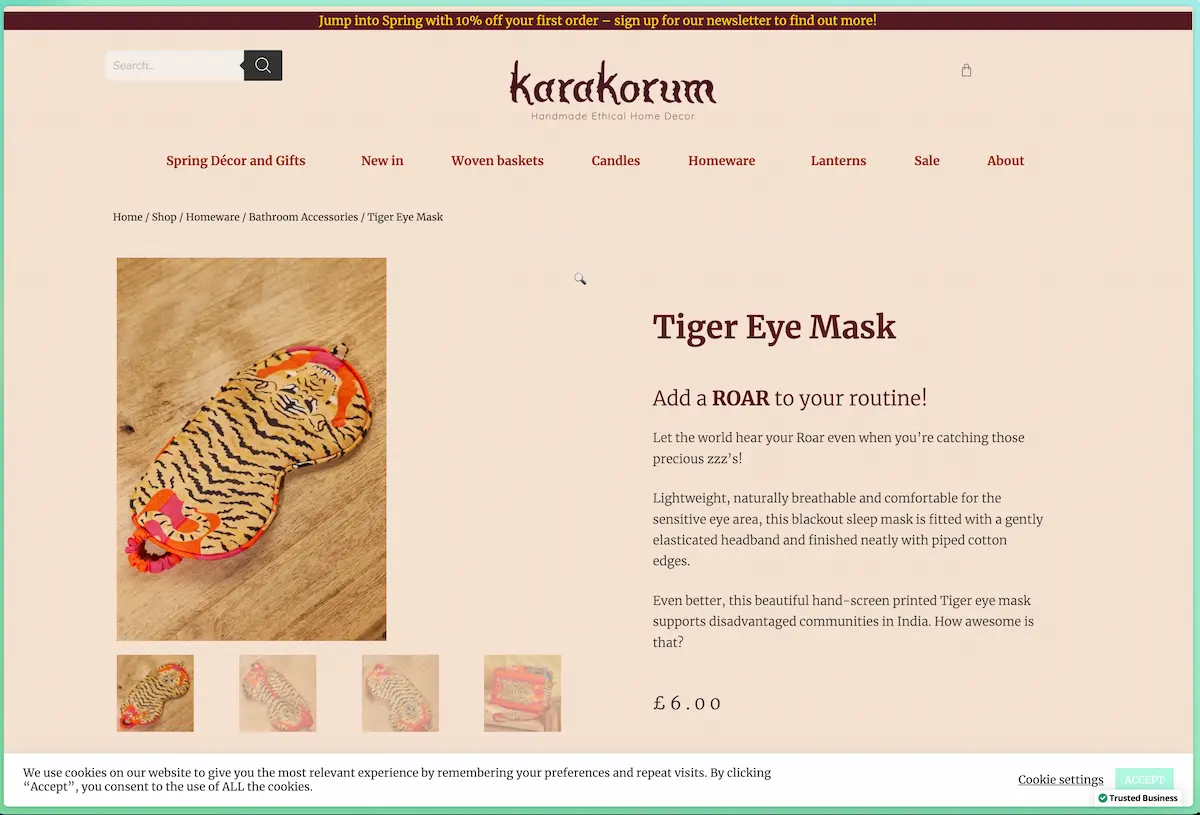
Many cookie consent tools use deceptive patterns by default
Cookie bars have become a bit of a nuisance since the GDPR came into force in 2018. On some pages, the opt-in toggles seem to go on forever. On others, opting out of advertising cookies means you can’t even see the content.
But the worst practice is the leading choice of colours for the Call to Actions:
- “Accept all cookies” is a green button, as in the Karakorum example (or the most noticeable one)
- “Customise your choices” is a grey button (or even just a text link)
- “Reject all” is often missing altogether
Most cookie consent tools come with such dodgy presets out of the box.
By using them unchanged, you suggest two things to your visitors:
- What you really want people to do is accept all cookies. That’s why the “Accept all” option is green or highlighted in a bright colour.
- You don’t care about their experience enough to customise your tool – and help them make the best choice for themselves. By highlighting the choice that benefits your business (collecting more information) and not your customers (honouring their privacy), you send a powerful signal: “We put our bottom line before doing right by our customers.”
The takeaway:
- Avoid showing visual preference for choices that benefit your business more than your visitors.
- Get professional support to weed out any deceptive design patterns in your online store.
Put everything right where it belongs
The easiest way to spot inexperienced web designers or online store owners is probably not what you’d imagine.
They don’t necessarily have ugly websites or a dodgy visual brand.
Instead, you’ll find design elements in unconventional and unexpected places. The overall design screams “novelty”, in an attempt to delight the customer.
But when you interact with the website, there are far too many surprises – and it’s almost impossible to get the job done.
Misguided novelty is an easy mistake to make when you want to stand out. But it creates visual noise that distracts from the three things your online shop needs to do:
- Help people discover your products
- Help people decide if / which ones they want to buy
- Make it easy to buy your product
Everything else is surplus. It might even harm your business by getting in the way of the purchase.
What kind of thing do I mean?
- Social media logos in pride of place on ecommerce pages
- The cart spelled out as “Cart” rather than having a symbol (ideally, use both)
- Social sharing buttons directly above or underneath the title on product detail pages
- The cart menu item in the middle of the top navigation bar instead of in the top right corner, where it usually is
- Lots of tiny product images that don’t open in a lightbox when clicked, instead zooming into a detail view
The thing is, User Experience (UX) conventions exist for a reason.
They’ve been tried and tested for years or even decades. They help visitors find their way in an unfamiliar online shop, fast. And they reduce cognitive load, so they can focus on what matters most: your wonderful products.
The takeaway:
- Put your cart in the most prominent place of the menu. That’s usually at the top right.
- If you use social sharing buttons, place them underneath the purchase button, so they’re not the first thing people click – leaving your page, never to return.
- Make sure everything on the page is there by design. There needs to be a good reason for why it’s there, why it’s not somewhere else, why it looks exactly this way, and how that fits into the bigger scheme of your overall website design.
- Clear your product pages of links that take visitors away from your online shop – and therefore away from making a purchase.
Experienced designers will get these details right without you even asking – leaving you free to focus on your product strategy.
Make it easy to find more information about the product
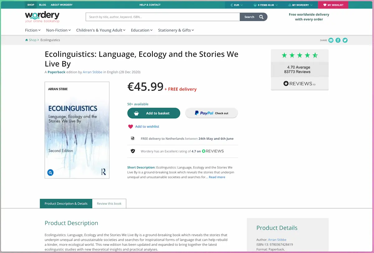
Make sure important product information isn’t hidden away in tabs. As Baymard Institute reports, core product content is overlooked in ‘Horizontal Tabs’ layouts – it might as well not be there at all.
A tiny step for your website designer, a giant leap for your website conversions
It’s surprising how many people miss information displayed in tabs or don’t understand that they can click certain visual elements for more details.
Some reports put it at up to 25%.
You might think, “Fine. So the majority gets it.” And of course, you’re right: the majority gets it.
But what if you could magically get 25% more conversions just by removing the tabs?
That’s why we always recommend looking at those percentages in terms of how much more you could gain with quite a small investment – as opposed to thinking, “Okay, 75% get it. That’s the majority. I’m fine with that.”
It can take lots of effort to achieve even a 5% conversion lift. Even a 2.5% or 3% improvement is cause for a celebration. That’s 3 more people buying something for every 100 that land on your page.
An improvement like that can make a huge difference to your business bottom line.
The takeaway:
- Avoid using horizontal tabs to present your product details.
- If your online shop template has horizontal tabs, write a strongly worded email to the provider and get a custom website designed.
- Snap up the easy UX wins to build the best possible website based on evidence.
To sum up:
To maximise conversions, home-made website design and out-of-the-box tools aren’t going to cut it. Instead, hire web design professionals for the job. They’ll dress your powerful product messaging in the robes (or ball gown, or track suit) that will make visitors feel like a million dollars.
And you’ll spend less time tweaking, twiddling and fretting.
Convert more visitors with the right information
Now let’s talk about website copy.
This article may have started with the design of your site, but don’t get it twisted: We always recommend a copy-first approach.
The role of a web designer is to find the best way to present your copywriter’s content – not to tell them how many words they can write about your product.
A copy-first approach helps to make the web design process more efficient, too. So your online shop can relaunch faster – and you can cash in on the results sooner.
With that in mind, let’s look at two of our best website copy tips:
Clear and concise converts better than clever
People come to your online store with specific goals in mind. Don’t let wordy messages get in their way.
Strip your copy to the bare essentials: you want visitors to take in the information at a glance. Reading your website should feel effortless.
Even if your website copy is helpful, never forget that people may be in a rush or on the go.
Depending on your product, maybe even literally so: Chris Gibbins, CXO at Creative UX, invented the “Running Test” based on his experience buying train tickets while literally running to the station. (Find his LinkedIn post here.)
And while you might not be running while trying to track a parcel, here’s an example from an info banner, announcing a shipping delay:
Please note, Royal Mail is experiencing some delays due to covid-19 restrictions and allow for a little bit of extra time for your item to be delivered.
That’s good to know. It’s a helpful message. But it’s useless for people in a rush:
- It’s unclear: “Royal Mail is experiencing some delays… and allow for a little bit of extra time.” Royal Mail allow for a little bit of extra time? I bet they do! All sarcasm aside, that phrasing doesn’t make sense.
- It’s too wordy: there’s no need to say “please note”. It’s a banner. It demands to be noted by its very existence.
The takeaway:
- Use language that’s easy to understand.
- Keep sentences and paragraphs short.
- Delete all non-essential words.
- Structure your website copy with subheadings and lists.
- Choose clarity over trying to be overly clever with unfamiliar allusions, cryptic metaphors or technical jargon.
Keep their attention: deflate bloated descriptions
Optimise your product information so it gets to the point quickly.
One simple way to achieve this is to cut out adjectives. Adjectives are descriptive words such as
- “stunning”
- “geometric”
- “perfect”
- “beautiful”
Too many adjectives will make your copy bloated and suck the life out of your product descriptions.
If you’re going to use adjectives, choose only the most specific ones: those that are so precise that people will remember them – and your product.
Never repeat an adjective unless you’re trying to rank for it as part of your Search Engine Optimization strategy.
Avoid value statements like “stunning” or “beautiful”: they don’t tell your target audience anything about your product. All your visitors learn from a word like that is that you think your products are the bee’s knees and want them to think so too.
This can feel manipulative and unethical – and harm your sales.
Use the language of your target audience
Lost for words?
The best product copy often comes from your customers, not a professional copywriter.
So look at your customers’ reviews. Check Google Search Console to see what search queries lead them to your online store. Read reviews for competitor products to find out about pain points.
And if you can, integrate reviews directly into your product detail pages.
If you’re not exactly swimming in testimonials, check out our ebook chapter on how to get more reviews.
The takeaway:
- If you write your own copy, select unique adjectives that bring the product to life in your reader’s mind.
- Avoid value statements – stick to the facts.
- Borrow expressions from your target audience.
- Include customer reviews on the page.
To sum up:
Resist the temptation to wow your target audience with clever wordplay. Keep it short and simple. Align your copy with how your ideal customers express themselves, and it will resonate. And whatever you do, make sure you include testimonials.
Get a website that looks stunning – and converts browsers into buyers
From small business owners to corporations: every business needs a website that delivers a seamless experience.
At From Scratch, we create and continuously optimise high-converting websites for our clients.
By designing a clear strategy for your product messaging, we make sure that your product copy covers exactly what your desired audiences want to know.
Plus, we design, develop and maintain the backend of websites that are free from deceptive patterns, follow a privacy-first approach – and minimise CO2e emissions.