The 4 Secrets to Winning the Content “R.A.C.E.”
Written by:

This morning, Facebook feed greeted us with the question: “How do you create awesome content when you’re on a tight schedule?”
It’s a trendy problem to have. According to research quoted by KOMarketing, the number one marketing challenge is “time”.
This was followed by “content quality,” “creating content” and “scaling content.” Other challenges noted by marketers had to do with creativity. “Getting creative” with their content, “coming up with original ideas,” and “producing quality and quantity” were deemed creative obstacles for marketers.
There’s a whole debate going on about Quality versus Quantity in Content Marketing, and it’s reflected in the responses to that Facebook post. Recommended tactics range from making lists and swipe files, to using dedicated tools, to hiring cheap bloggers on a freelancing platform.
They all have one thing in common: the false notion that “Content is King”, no questions asked.

In this article, we’d like to suggest a more mindful approach. From Scratch has its roots in customer care — and an attitude of caring for our readers is always a useful guide to the rapids of content creation.
If you take away one thing from this article, let it be this:
Content should help people complete their task, effortlessly & enjoyably.
Whether that task is to find their new favourite pair of shoes, relax after work, sign their child up for ballet classes, or pay a parking fine. Pre-sales or after-sales, content should help people do what they came to you for.
Introducing R.A.C.E.
“RACE” stands for 4 criteria that determine if your content does that job:
- Range
- Accessibility
- Correctness
- Effortlessness
Read on to find out what they entail.
1. Range: What Content Do You Need?
A lot of brands fall into the trap of looking at their competitors’ websites too much. We’re not saying you shouldn’t check out what your competition is doing; you totally should! But don’t look at 10 websites in your industry and assume that because they all have ginormous sites with 25 subpages and a blog that’s updated 3 times a day, that’s what you should do too.
Set goals for your content
The most important thing is to know exactly what you want to achieve for your business in a given period of time. Before you start tweaking your website or you head over to Canva* to make some nice images, write down that #1 goal your business needs to achieve for you in that time period.
For example, Sabine likes to work with one long-term vision and concrete goals for a shorter period (usually, she sets a vision for the next 5 years and concrete goals per quarter).
If your company is big, or you sell physical products, you may have to plan much further ahead.
Now think of the role your website plays in reaching that goal:
What’s the #1 goal of your website? Again, write it down.
What does this look like in practice?
Let’s say your business goal for this year may be to double your revenue, so you can grow your team — creating full-time employment opportunities for vulnerable people in your local area.
Applied to your website, this could translate into any of the following goals:
- Turn more traffic into sales by increasing your conversion rate
- Win 2 new wholesale contracts per month
- Rank higher in search engine results for specific long-form key words
Importantly, decide on one of them, or 2 at most. Which goal is right for your particular website depends on your offer, how you typically sell it, how people find you, whether you send regular emails… a cookie-cutter approach won’t work here.
Next, make a list of all pages your website currently includes — whether accessible through a menu or linked deep within posts.
As a fictional example, the Konjac Sponge Company might write a long list like this:
- Facial Sponges
- Body Sponges
- Mini Pore Refiners
- Baby Sponges
- Tattoo Sponge
- Pet Sponge
- All Products
- New In
- SHOP BY KONJAC SPONGE CO COLLECTIONS
- Premium Facial Sponges
- Mythical Sponges & Hook Sets
- The Heart Collection
- The Elements
- Mini Pore Refiners
- Award Winners
- SKIN CARE SOLUTIONS
- Beauty Sleep
- Beauty Tools
- Biodegradable Packaging
- Chakra
- Cosmetics
- Face Masks
- Health Protection
- Wearable Beauty
- Vegan Life
- OTHER BRANDS
- Chireureu Paint Soaps
- Flow Cosmetics
- Freon Collective
- Huangjisoo
- Korento
- Lizzie Loves
- Okioki Hyaluronic Acid Beauty
- Yadah
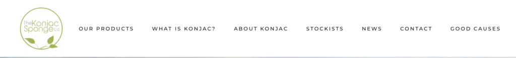
- WHAT IS KONJAC?
- ABOUT KONJAC
- STOCKISTS
- Find a store
- Online Stockists
- NEWS
- CONTACT
- GOOD CAUSES
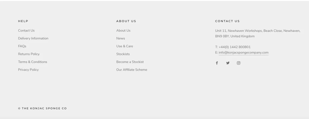
- HELP
- Contact Us
- Delivery Information
- FAQs
- Returns Policy
- Terms & Conditions
- Privacy Policy
- ABOUT US
- About Us
- News
- Use & Care
- Stockists
- Become a Stockist
- Our Affiliate Scheme
Next, set or change the goal of each part of your website.
Every single page or piece of content should contribute to the business goal you’ve set yourself. Is there a page on your current website which doesn’t have a specific, measurable goal attached? And what if each page has a goal, but it doesn’t contribute to your business goal?
=> Either assign a (new) goal to that page or de-prioritise it by moving it to the footer menu or hiding it altogether.
Let’s look once more at the Konjac Company example above.
The distribution of their menu items in the website header and footer suggests that this company’s goal is to grow their consumer sales, mainly by attracting new people who’ve never bought a Konjac sponge before.
How do we know?
Because their link for new stockist applications is ‘hidden’ in the footer menu, as is their customer care information. This tells us those aspects of their business are not their highest priority right now. On the other hand, they have decided to highlight their shop, their store finder and the basic information about what Konjac is — by adding those items to the header menu.
Research what people really want to know
The web is the primary way people research and buy from brands. According to Eptica, “45% of consumers will abandon an online transaction if their questions or concerns are not addressed quickly.“
So your web content needs to fit perfectly with the conversation taking place in people’s heads while they’re on their way to helping you achieve your web page goal.
This will also help you preempt many unnecessary emails, calls and chats.
The most important thing here:
Don’t make things up — it’s better not to have any content than to have loads of irrelevant stuff and create a bad reputation for your business. If people don’t learn something interesting, they won’t want to return to your website.
Here’s how to find pointers for what content you need:
- Check your website analytics for the search terms people use — both in order to find your website and once they’re already on your page, doing what you need them to do in order to reach the page goal you set.
- What percentage of your visitors click the various buttons on your page (also known as ‘conversion rate’)? Can you think of a crucial bit of information, or a design change, that would help more people see the benefit of converting on that page?
- Which of your pages get the most traffic? Can you explain why?
- Look at Google’s “Related Searches” to dive deeper into the kinds of questions your audience has about your products and services.
- Research your ideas with a free keyword tool. Answerthepublic.com, for example, visualises commonly asked questions about anything you search for.
(we’re not affiliated with Answer the Public, and alternative services exist.)
Add real questions from your customers and prospects
Make time to review emails, calls and chats from your customers at least once a month to update your content.
“Answer your site visitors’ questions throughout your web content, not only in sections called frequently asked questions.”
— Gini Redish, Letting Go of the Words
Make FAQs part of your strategy
Your blog and social media posts build trust by linking into your audience’s interests. They also show that you share their values.
The same can be said for the most useful FAQs. Check our blog post about FAQs for tips on how to integrate them into your content strategy.
More than just text
Depending on the topic, decide whether text, videos, graphics or audio will be most useful:
- For example, a short video can really make your About page come to life.
- An infographic can help you elegantly communicate the complexities of your supply chain (Rapanui do this beautifully).
- Offering sound recordings of your blog posts can help you reach busy people (they might listen while driving, for instance). If you ask members of your team to read out their own content, you can even boost your brand image.
GLS Bank, a social-ecological bank based in Germany, have started offering such audio versions of their blog posts on Soundcloud. To see an example, check out this post about crypto currencies such as Bitcoin and Blockchain (in German).
Multimedia approaches can also help you reach a more diverse audience — which will help your search engine ranking, too (accessible websites are usually automatically more SEO-friendly, too).
2. Accessibility: How Can You Serve More People, Better?
While ‘accessibility’ is a term often used in the context of users with disabilities, we all benefit from the principles it stands for. Accessible content is easier to find and use, often easier to auto-translate, and can even be more attractive.
Think about your visitors with impairments and disabilities
There are lots of easy things you can do to help people of all abilities use your site.
Here are just a few tips:
- The visually impaired will appreciate dark mode, high-contrast colour choices, text labels on forms, and alternative text for all images. They often rely on automatic screen readers when browsing the web. Those programs allow the user to hear a list of all links, which helps them decide where to go next. That’s why it’s so important to avoid using “click here” wording for your links and make them more descriptive instead. If you’re into a bit of coding, you might also want to swap your <b> (bold) tags for <strong> and your <i> (italics) tags for <em>. You’ll achieve the same visual effect, and the screen reader will be able to make the and emphasis audible by reading those words differently.
- Avoid juxtaposing red and green design elements because colour-blind users won’t be able to distinguish them.
- Add closed captioning to your videos, and offer transcripts to audio content. Deaf and hard-of-hearing people will have a better experience — as will those of us who are in a public space without headphones. You’ll also get better engagement on social media that way.
- Switch off video auto-play to protect users with photosensitive epilepsy.
- Clear fonts in larger sizes, simple language, lots of white space and sufficient leading (the distance between lines of text) all make it easier for dyslexic users to read your written content. It’s also a great way to include non-native speakers, folks who didn’t do fantastically at school, and anyone who’s distracted or tired. (Let us know if you have not spotted yourself in that list!)
Mobile friendly design is a form of accessibility, too
According to Google, 94% of American smartphone users “search for local information on their phones. Interestingly, 77% of mobile searches occur at home or at work, places where desktop computers are likely to be present.” Some websites are nearly unusable on mobile, and thus exclude a huge amount of potential business.
3 tools to help you tackle accessibility on your site
- WAVE Web Accessibility Tool — type in a URL and see detailed feedback on that page’s accessibility. For ‘power users’, browser extensions and APIs are available too. The only downside is that it doesn’t seem to play that well with all different hosting platforms and content management systems, and its own user interface is rather clunky.
- Funkify Disability Simulator — a Chrome extension that helps you experience the web and interfaces through the eyes of users with different abilities and disabilities. We love the fact that people working in glaring sunshine, dyslexic readers and users with shaky hands are included, too. This is a real game changer for user empathy. The project is financed by The Swedish Post and Telecom Authority (Post och telestyrelsen, PTS).
- From Scratch Website Conversion Copy Audit — we can only touch the surface in this blog post. If you’re unsure whether your own website should be more accessible and how, check out our Website Conversion Copy Audit. It includes details of how to improve your content and how to prioritise those tasks to make your overall website more successful.
3. Correctness: Is All of This Still True?
We can’t tell you how many times we’ve groaned, repeatedly reading that incorrect ‘fact’: the fashion industry is the second biggest polluter on earth. It even happened at NEONYT in 2019… almost 1.5 years after we first saw that myth debunked by Francesca Willow (aka Ethical Unicorn).
Accuracy sets the baseline for ethical content creation.
If we want to be taken seriously, we must beware of ‘fake news’ — and anything that’s so outdated that it’s no longer useful. Here’s how to make that happen. If you like Marie Kondo, or The Minimalists, you’ll enjoy this one:
Get into the maintenance habit
Anything that looks like it’s not been updated in a long time quickly destroys trust. So make regular maintenance a habit:
- Once a week, review product updates to see if anything needs changing.
- Once every quarter, plan a more thorough review. Read each piece of info you’ve got on your site and retire, change or completely revamp every article to make it fit for purpose (= that goal you set for each page).
- Bonus: the most joyful way of maintaining your content is to pull older material from the archives and present a fresh version to your audience. That can make for a speedy piece of content, as you’re not reinventing the wheel.
No date is better than a date from last year
This is such a low-hanging fruit that we’re tempted to call it a meadow orchard.
If possible, switch off the date function on your content management system. Otherwise, you’ll need to make small tweaks to all your content all the time — because anything that’s not been updated in half a year doesn’t inspire much confidence with your users.
Good proofreading is essential
Have someone else check your website for spelling, grammar and punctuation. It’s easy to miss typos that your spell check program doesn’t pick up, and punctuation is a tricky subject. A fresh pair of eyes can usually find those errors more easily.
4. Effortlessness: How Can You Make Your Website a Joy to Peruse?
If you read this blog regularly, you’ll notice that we keep banging the drum about customer effort, especially in terms of user experience design. There are also a few things you can do with your content to make sure things feel a doddle, not a chore:
Tag your content to give it structure and intelligence
Finding the right info can be a needle-in-the-haystack experience. Tags change that. With tags and clever algorithms, you can show the right articles to the right people, at the right time in their buying journey.
You can group and reshuffle articles by topic to give them new purpose and spark. You’ll be seen as someone who knows their onions and their audience — in other words, as much more trustworthy.
Language matters
People read differently on screens: they scan for information.
So make sure the way you present text on screen helps them do that:
- Use short paragraphs, headings and subheadings
- Use bullet points and numbered lists
- Don’t use justified or centered text (except in headlines) — it’s harder to read
- Don’t write long pieces of text in ALL CAPS
- Neuroscientific research shows that negative language creates stress — even if it’s just a single word like “no”. So stick to positive language to infuse your copy with a feeling of ease.
And finally…
Create the content you find the most fun
If you’re overwhelmed, try this exercise:
Imagine a content cake.
What kind of cake is your favourite? That’s exactly the cake you have in front of you.
Imagine every detail of the cake… what it looks like, how it fills the room with its unmistakable cake scent… its texture…
Here’s a question for you:
What part of the cake appeals to you the most?
Is there a slice you want to eat first?
Or do you perhaps want to cut a circle from the very centre of the cake and avoid the crust?
Do you long to eat only the marzipan decoration?
Go for it. Start with the slice of the content cake that you enjoy the most.
Your joy will permeate the piece you create. Your website visitors will feel your joy when they read or watch or listen to your content. And the joy of creating will give you plenty of energy to tackle another slice of the cake, or overcome some of the tougher parts (a tiny but of burned crust isn’t so bad when the overall recipe is amazing).
Let joy be your guide, and you’ll have way better content.