We crafted creative conversion copy and a verbal identity for the UK’s first plant-based, packaging-free online shop, Forrist. We already collaborate with a lot of businesses in the green sector, but we loved this opportunity to work on a more creative project for a product-based sustainability business. It gave us the chance to flex our superpower muscles, aka be the human Venn diagram for brand writing, conversion copywriting and SEO.
About Forrist
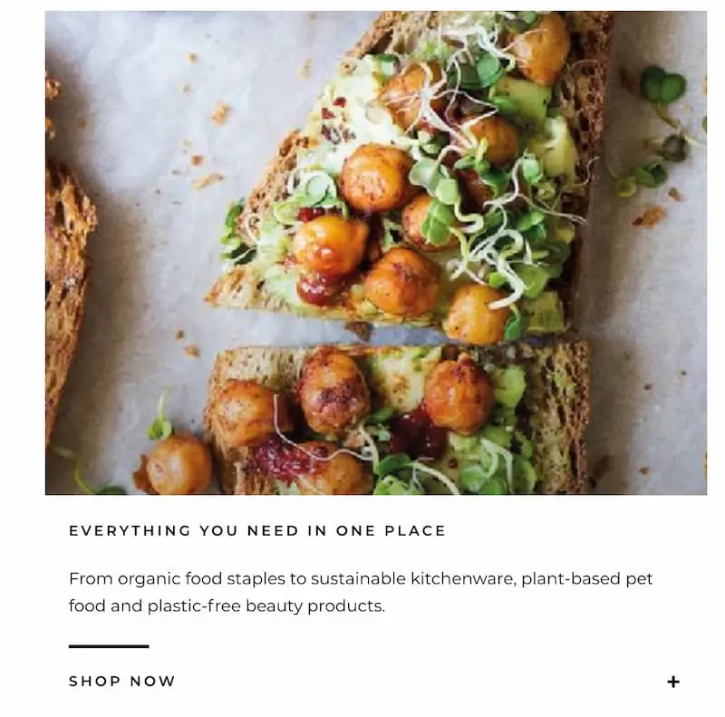
The client’s aim was to create a Waitrose in zero-waste form: an online and bricks-and-mortar supermarket where everything is plant-based and plastic-free. That way customers can get all their shopping in one place, from household goods to groceries and beauty items.
The team at Forrist already had stunning graphics and a great concept. But they were struggling to create their verbal brand identity and convey their message in an authentic way that would turn window shoppers into paying customers. They screened a lot of agencies and copywriters, looking for people who truly “got” sustainability. The team found From Scratch via our ProCopywriters profile and knew from our background that we were a good fit.
As with all our projects, this one began with research – specifically, mining voice-of-customer (VOC) data. Since this was a new venture with no previous customers to interview, we looked to reviews of similar online stores and services.
They yielded interesting results. Customers cited different benefits to the ones that Julia, the creative lead for this project, had brainstormed. It was a prime example of why we always use research, rather than assumptions, to guide our copy.
For example, the topics — and, in fact, the specific words — ‘convenience’ and ‘affordability’ came up again and again. Message mining also showed that ‘everything in one place’ was a common theme, as was quick delivery.
This directed the messaging hierarchy and is why the H2 includes “for all your organic essentials”. We made sure ‘convenience’ and ‘affordability’ were addressed above the fold with “Choose the amount you need” and reference to next-day delivery, almost like a ‘reasons to believe’ bar. The aim being to reassure the reader and show them straight away that Forrist matched up to what they were looking for in an online zero-waste shop.
If research was the foundation stone of this project, verbal identity was the framework that we built around it to form a cohesive brand.
We started off by creating a tone of voice and guidelines for how the brand would communicate. And we made sure to infuse this throughout the website, including in the FAQ copy, as in the Returns section below.
As Julia explained in one of our newsletter emails, the FAQ section is one that’s often neglected. And failure to weave in the tone of voice here can make brands seem inconsistent at best and hard to understand or untrustworthy at worst.
The challenge was in striking the right balance – making sure the voice was consistent but not overdone. When the tone is personable, witty and no-nonsense, you can risk pushing it too far or copycatting brands like Innocent.
We added nods to Forrist’s more playful side on the home page:
Forrist unveils its playful side with personification descriptions on the homepage: “Some of our products like to go nude”
A key element to Forrist’s ethos is their ‘learning in the open’ mentality that welcomes people to get started on their zero waste journey without worrying about it being perfect. We injected this down-to-earth personality into the hero section. Time reports that on average, you only have 15 seconds to engage a reader online, so first impressions and grabbing their interest early on helps.
Just as with its products, Forrist doesn’t hide its personality behind any kind of packaging: what you see is what you get
We also brought their Jobs section to life (almost literally) by sowing forest and plant metaphors throughout the page to play on their brand name.
How we played on the concept of forests to bring brand writing to life: “Our root and branch approach to values and work ethic”; “At our core is sustainability”, “it’s the trunk holding the Forrist together”; “Just as trees need a protective layer of bark, in the Forrist, we rely on hygiene standards to keep our staff and customers healthy”; “Where there’s a flourishing Forrist, there’s always blossom”.
Copywriting Duo
An integral part of our copywriting projects is working as a duo – a copywriter-and-editor team. On this project, Julia (hey there, so weird to write about myself in the third person) was the creative lead. This meant she researched and used creative writing exercises to craft the first draft. Sabine would then edit the copy following the Copyhackers proofreading-for-conversion method. She also tested the copy to evaluate how well it converted and created wireframes to check how it worked in action.
In fact, the hero section went through different iterations as we ran it through Five Second Tests. This part of the website posed a number of challenges.
The first being that Forrist has many unique selling points (USPs), and we only had a few words in which to get the meaning across.
The second issue we were conscious of was not sacrificing clarity for style and uniqueness. We wanted it to be clear exactly what Forrist was — both for ranking purposes and for people landing on the site.
Following various rounds of feedback from Five Second Test users, we altered the hero section until we had three headlines and subheads that communicated the primary message clearly every time.
For example, this version didn’t perform very well:
The H1 “Buy organic. Eat plants. Reduce waste” didn’t test well
But these options were both memorable and clear:
The H1 “The online plastic-free supermarket” and the text underneath “We’re the UK’s first online supermarket where everything is organic and plant-based – and almost everything is compostable or reusable. (We’re working on the other 2%.)One of the H1s that tested well: “Sustainable shopping made convenient”Documenting the testing process: the H1 that we eventually used: “The online plant-based supermarket”
SEO And UX
Given our process so far, it shouldn’t come as a surprise that our SEO copywriting also starts with research. After doing keyword analysis and auditing competitor sites, we had our keywords to use in the seven main places.
In case you’re wondering, that’s in
the page titles,
the meta descriptions,
the first 100 words on the page,
a few other times on the page,
the H1,
the H2s if it’s not possible in the H1, and in
image names.
We included these in the copy file in a plug-and-play format for the Forrist design team.
While there was no audit to run on the Forrist site as it was still being built, we could offer advice on UX and SEO practices. The misconception is that SEO is purely about making your site search engine-friendly. But this should never come at the expense of usability. In fact, we like to think of it as human first, Google second. We treat it as a human-centric practice that, when done right, also keeps the search engines happy.
Now that Google index is mobile-first, it’s even more important that sites are easy to use on other devices. We made sure to test the Forrist site on mobile and flag up tech issues we found. To reduce bounce rate and improve dwell time, we also offered advice on design for readability and accessibility, sliders as well as menu structure.
The Results
Forrist set up, launched and flourished during a global pandemic. And they continue to expand their product range as demand increases. Want to take a closer look? Here’s what we delivered: