Inspiring new subscribers with your welcome emails
Written by:

Welcome Email Clinic #4: Ethical Brand Marketing — Painting a Better Future for Social Entrepreneurs
Finishing (for now) the series of posts in which we take a close look at one specific email — putting a positive spin on “copy teardowns”
About these Email Clinics
Copy “tear-downs” are having a bit of moment on the internet. For years, we’ve resisted the urge to take part in this movement — even though we LOVE looking at specific copy examples in detail and suggesting improvement ideas.
Thing is, we don’t like criticising brands behind their backs.
So we’ve developed Clinics as our own version of these “teardowns”. For a limited time only, members of the #Ethicalhour community had the chance to get an in-depth video assessment of their email copy, free of charge: what it looks like, how it reads, what’s working really well, and what could be improved.
This series of articles presents a summary of each assessment, so we can all learn from these emails together. You may also want to sign up to these newsletters just to see what changes were made based on the clinics!
About Ethical Brand Marketing
Ethical Brand Marketing is a company offering marketing strategy to brand owners & marketers focused on making the world a better place. Founder Jessica Lohmann helps clients to create and implement an ethical marketing strategy that not only increases their revenue and turns them into leaders of positive change in their industries. She also helps them save our environment and as many animals as humanly possible.
An American expat in Germany with nearly 30 years’ experience as a marketer, Jessica is a strong voice in favour of animal rights, non-manipulative marketing and collaboration over competition.
Welcome Email to New Subscribers to Ethical Brand Marketing: Subject Line
Tip: Make your email stand out in people’s inboxes to increase your open rate

One thing has almost become a bit of a trademark for Ethical Brand Marketing: there are always these two emojis at the beginning of all subject lines.
That’s a clever move.
On the one hand, it helps the recipient to see these emails in their inbox straightaway — emojis draw the eye. And these ones also really fit the brand. Secondly, it’s always worth adding something to your subject line to make it special.
That could be
- your recipient’s first name
- an emoji that suits your brand or the topic of your newsletter
- numbers, ampersands, symbols or arrows (Jessica used an equal sign = )
- a particularly short or particularly long subject line (Jessica’s is really long, so it will stand out in people’s inboxes)
Don’t go for average length subject lines or anything else that lets your emails blend into the background. After all, your emails need to be noticed in order to get opened.
Not Every Welcome Email Has to Say “Welcome” or “Thank You”
Here, instead, we have a description of what’s inside. The subject line is pointing to the freebie inside as a reward for signing up.
And it goes into the details of the lead magnet content. This in turn makes the subject line longer, increasing the email’s visibility.
It’s a good example of you thinking about the content and the way you’ll present it helps to pull things together and achieve good results all around.
That makes the purpose of this email clear and specific. So if you signed up in order to get this guide, you will be quite likely to open the email and get that guide.
Sender Info
Tip: Display your name according to the cultural expectations of your customers

Jessica has decided to use her full name — not just a first name, as many people do in the US or the UK.
From talking with Jessica, that’s probably because she lives in Germany. German culture is a little less informal, a little less casual than the UK, the US, or the Netherlands — where people are usually on first name terms.
In Germany, people still use title and last name a lot. So by using both first and last name, Jessica can appeal to both cultures, or both levels of formality at the same time.
She also mentions her brand as well so we can remember the context of the email.
Thanking the Reader for Signing Up
Tip: Let your brand “infuse” every nook & cranny of your email
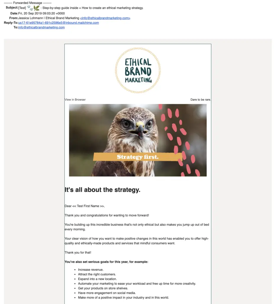
Strategy first.
It’s all about the strategy.
Dear <<Test First Name>>,
Thank you and congratulations for wanting to move forward!
You’re building up this incredible business that’s not only ethical but also makes you jump out of bed every morning.
Your clear vision of how you want to make positive changes in this world has enabled you to offer high-quality and ethically-made products and services that mindful consumers want.
Thank you for that!
You’ve also set serious goals for this year, for example:
– Increase revenue.
– Attract the right customers.
– Expand into a new location.
– Automate your marketing to ease your workload and free up time for more creativity.
– Get your products on store shelves.
– Have more engagement on social media.
– Make more of a positive impact in your industry and in this world.
Ethical Brand Marketing (EBM) is all about helping animals, the vegan lifestyle and protecting species diversity.
The welcome email cleverly shows off these values through branding every detail.
It’s the perfect embodiment of “ethical brand marketing” in action:
- The logo at the top is easy to take in. The green font and savannah-coloured ring of footprints hint at the company’s ethos.
- For better accessibility, there’s the option of viewing the email in the browser.
- “Dare to be rare” — a nifty way of adding a reminder of one of EBM’s core messages.
- The brand imagery is continued in the picture of the eagle, matched with the headline: “Strategy first”. Not only does this represent EBM’s focus on strategic marketing (as opposed to, for example, marketing operations or copywriting) — the eagle’s proverbial bird’s eye view strategic hunting skills are the ideal fit for this message.
Meet your readers where they are
The main body of the email starts with an almost-repetition of the “eagle headline”:
“It’s all about the strategy.”
While verbatim repetition is usually counterproductive, variations on a theme can help to “rub it in” — reminding people of the message without boring them.
The email starts with the usual thanks but adds congratulations — celebrating the step that the new subscriber has just taken and building excitement for the future.
Notice how many sentences start with the word “you”: there’s no ego in the beginning of this email. Instead, the subscriber receives validation and confirmation for the incredible business they’re building and their clear vision. There’s another thank you to round off this look at the “as-is”.
And then we look at the future. This person’s likely goals. The bullet-point list is concrete enough to show EBM knows their audience, but formulated loosely enough to avoid presumptuousness.
Future Pacing the Transformative Effect of this Newsletter
Tip: Demonstrate customer focus & accountability by offering a transparent email roadmap
The list of goals is followed by a humorous purple text block, which takes all these future goals and links them directly to what Ethical Brand Marketing does. Many brands try to imply this connection between their mission and the reader’s desires. But an explicit statement is often more effective.
The only aspect that could be improved here is the colour of this block. For my taste, it introduces just a little bit too much design variation, which makes the email appear less professional. The colour scheme and font selection look very aligned at the top, and while the purple colour certainly pops, a yellow, green or pink background would give a slicker impression.

Goal setting is great, but goal reaching is even better!
What will help you reach your goals?
An impactful ethical marketing strategy!
You’re in the right place if you want to reach all your goals.
I’ll teach you how to sustainably run and ethically market your purpose-driven business.
Download this step-by-stop [sic] guide to learn how to create an ethical marketing strategy.
Over the next few days, I’ll also send you 4 emails that will help you:
1. Define your ideal customer to be able to more easily attract him/her.
2. Get your products into stores.
3. Get ready for an ethical revolution.
4. Optimize your marketing strategy by giving you the opportunity to schedule a free 30 min. strategy session with me.
If I have something important to say in between these 4 emails though, I’ll send that to you as well.
That could mean, you’ll get 2 emails from me in 1 day. That’s rare though and will only happen in the beginning while my welcome series automation is running.
After the 4th email with the link to schedule a call with me is sent, you’ll then receive my regular emails which I send about 1-2 per month. These will help you further with your marketing strategy.
I’m always here though, so if you have a question, please feel free to reply to this — or any other — mail.
Oh, and by the way, thank you for your help.
Because you joined a few hundred others to learn about strategic ethical marketing and signed up to our mailing list, you funded a day of rabies vaccinations for a street dog in Nepal through our membership with B1G1.
We became a B1G1 member on December 16, 2018 and give back every time someone subscribes to our newsletter, starts — or completes — a consultation project, helps us with tech issues, gives uns a positive review on Facebook, etc. so there will be more opportunities to help someone in need and I’m looking forward to working with you.
With B1G1, giving back is so easy, fun and affordable and is [sic] such a beautiful gift for those in need, as well as to yourself or to loved ones.
So, thank you for your contribution!
About ending headlines with full stops
The headline — “You’re in the right place if you want to reach all your goals” — is a fantastic confirmation of the value of having signed up to this newsletter.
However, Sabine always advises being careful with full stops at the ends of your headlines.
Jessica made a conscious decision to introduce full stops as part of her EBM branding.
As a conversion copywriter who focuses on helping you get the YES, helping you get people to read as much as possible of what you’re putting in front of them, Sabine would caution against using full stops in headlines.
Here’s why:
Full stops have been shown to stop people from continuing to read the rest of the document that you’ve put in front of them.
They also have a negative effect on their understanding of the text.
So, why would you still choose full stops at the ends of headlines?
Well, because you’re in good company, for example.
Some of the most famous print ads feature a big, bold full stop at the end of the headline. Helmut Krone, art director at DDB, is said to have started the trend with his iconic 1960s Volkswagen ads. And Apple still use full stops in headlines today.
Presenting the Lead Magnet
Moving on from the headline, we’ve now arrived at the place in the email where the freebie is given away.
As you can see, it’s quite late in the email — after validating the reader and introducing the purpose of the newsletter.
Usually, we would recommend linking the lead magnet early on in the welcome email. But in this case, the email’s structure is so focused, clear and aligned that it’s probably fine to offer the freebie further down.
The only thing here is a little typo: it says “download the step-by-stop guide”, instead of “step-by-step guide”.
It’s also just a little too easily missed without a big bold button that attracts attention. As we’ll see, there is one at the end of the email — but because simple links are often overlooked, it would make sense to add one further up as well.
That’s also one of the reasons why we usually recommend using the same link more than once in the same email (if it’s an important call to action).
Explaining “How This Newsletter Works”
Telling new subscribers how many emails to expect, and what they are going to be about — that’s a smart way to build the foundation for higher open rates. Suddenly, there’s something to look forward to; there’s a plan and a method rather than an unstructured influx of emails. The Welcome sequence now feels more like a course, where each email helps the reader move forward in a specific way.
It’s a pattern often used by tech startups to introduce new trial users to the functionality of the platform.
But any business that thinks deeply about the needs of their customers can benefit from this approach — no matter the industry.
And then there’s also this little caveat, which is just a reminder that Jessica is also human, and she may have something important to say in between the planned emails.
Sabine’s unsure about that section, though:
‘I found this section too long. I wonder if this could be simplified by adding something like “you’ll usually get one or two emails from me a month”. I’m not sure if we need that much information and would recommend streamlining the last 3 sentences of this section into one.’
Typography Perfectionism in Action: Dashes
Today, we’d like to give you a little bit of an insight into our perfectionist souls:
We can be a bit pedantic when it comes to typography.
So when we see a little “minus” or hyphen on two sides of an expression, word or phrase…
we always want to replace it with an em dash:

Now, let’s get into the nitty gritty for a moment:
In the table above, you will see that familiar and short hyphen.
And then there are two different kinds of dashes: a long one (the em dash) and a medium one (the en dash).
Most word processing software “autocorrects” certain hyphens into en dashes (when there should, in fact, be an em dash). Most email marketing platforms also most website content management systems won’t autocorrect hyphens.
So if you care about these things, or you write to a design-focused audience, it makes sense to learn the keyboard shortcuts for those dashes. (Or if you work with us, we’ll automatically correct them for you because we care about that stuff.)
Telling the Impact Story
Tip: Tell your impact story several times at different levels of detail
The impact part of the email starts with quite a long sentence: you can see it runs over more than two lines (viewed on desktop):

We would caution against using sentences this long in an email that most people will scan as opposed to reading it thoroughly.
But apart from the length, we’re also a little bit confused about the personal impact of each new subscriber:
- Have they funded a day of rabies vaccinations on their own by subscribing to this newsletter?
- Or is it that all of the subscribers together — a few hundred or thousand people — have been able to fund a day of rabies vaccinations?
For an audience of ethical, fair, sustainable brands, this kind of detail matters.
The impact section goes on to explain how Ethical Brand Marketing is a B1G1 member.
There’s so much information here that it could easily fill a dedicated email — perhaps a fifth one within the Welcome sequence. By adding lots of information about B1G1, the email shifts its focus away from EBM and what’s in it for new subscribers, and instead starts selling the B1G1 membership.
But the welcome email should only be selling 3 things:
- The newsletter subscription itself
- The relationship that you’re now going to build with the new subscriber
- Downloading & using the lead magnet.
Our recommendation would be to
- take off the detailed explanation of B1G1 memberships
- mention the rabies vaccinations further up in the email
This would connect the impact story more prominently with thanking new subscribers for signing up.
The Power of the P.S.
Tip: Use a P.S. to reinforce your message & call to action — if you introduce something new, always run a test

Now it’s time to start reaching your goals.[Button:] I’m ready. Give me the guide.
Have a fantastic day,
Jessica
p.s. I’m here to help you with your marketing. Since we’re just starting to get to know one another, please hit reply and finish this sentence: “If I had a marketing fairy, I would wish for…”
The P.S. is very popular with some readers. Some even read the P.S. first.
Some treat it like a TL;DR summary of the email (TL;DR stands for “too long; didn’t read”).
In this case, it’s not.
While it starts out as a summary (“I’m here to help you with your marketing”), it goes on to introduce a new call to action:
“Since we’re just starting to get to know one another, please hit reply and finish this sentence: …”
This is a clever way of engaging readers.
However, we always recommend limiting the number of calls to action.
If you want to use more than one, test how people respond to them. Run different versions of the email over time, and then see if you can increase conversion for your most important call to action (CTA).
For this welcome email, we imagine the key CTA is to download the guide. So people can learn and see how great it would be to work with Ethical Brand Marketing. So, we would take away the question about the marketing fairy and check if that increases downloads. We’d also send a short & crisp additional email just about this question to test if that increases response rates.
So this entire welcome email sequence could be turned into 6 rather than 4 emails.
As brand owners, we often think we have to pack each email so full to the brim — when in fact, we could just send a tiny email every once in a while. And From Scratch is no different! Just to be completely transparent, our own welcome email has more than one CTA:
- People can download a guide with 30 creative newsletter ideas (or a different one, depending on where they signed up)
- The email asks subscribers to reply to 2 questions
- And towards the end, it offers 3 links to different types of content.
There’s one simple reason why we’ve included so many CTAs:
The stats tell us that our audience responds really well to them. It may well be the same with EBM subscribers.
By the way: recurring CTAs at the bottom of the email are a different story altogether.
Because they’re always going to be there, you will experience some banner blindness. Click-through rates to the EBM website, Instagram, Facebook, and so on, will not be that high with recurring calls to action because people will stop paying attention to them. They fade into the background.
However, it may still be useful to offer these links for readers who are looking for them.
Summary
Make your emails easy to read with a clear structure, simple sentences and an obvious purpose
In summary, this email is very cleverly put together:
- From the long and consciously chosen subject line, through introducing Ethical Brand Marketing, to the design of the top with redundancy, avoiding exact repetition.
- The structure is really obvious.
- There’s a lot of validation, and then also future pacing so people know what they will get out of working with EBM and reading these emails.
The handwritten signature is a matter of taste.
We don’t really enjoy mock signatures in digital contexts because nobody “signs” an email. We find them kinda “old school”. But some people love them, and they can help to warm up a potentially less personal message.
Looking at things that could be improved:
- The purple text box could be improved by choosing a different colour and making sure it’s absolutely on brand.
- There’s a small typo that needs correcting.
- Some sentences are quite long — making sure we use simple and easy-to-understand sentences always pays off.
- The B1G1 sales pitch should find a new home so it doesn’t distract from the main purpose of this email.
- And the explanation of what’s going to happen after the first few emails is a little bit too long.
Get Your Own Email Clinic (Almost) for Free
Help us protect the Rainforest for a chance to get a FREE email review
What if every good brand had access to high-quality email clinics… no matter their budget?
What if there was a way we can all learn from each other?
What if our inboxes were filled with emails that we want to read, and that help us achieve the Sustainable Development Goals?