Your sales page is probably not long enough
Written by:

Edited by:
If your business offers services, online courses or high-end products, chances are you’ve got sales pages on your website. Some of them might be long-form sales pages, running to 2,000 words or more.
And you might be wondering:
- Do my sales pages really have to be this long?
- Do people even read all this content?
- Couldn’t we get away with a shorter page?
If your conversion rate is not quite as high as you’d hoped, you probably feel tempted to hit delete on most of the copy – and keep it short and sweet.
But here’s the thing:
In my experience, the number one reason why short-form sales pages do not convert is that they’re too short.
Yep, this is so counterintuitive that I’ll say it again:
If your sales page does not perform, it’s probably not long enough.
Not long enough to:
- bring your reader along on an emotional journey
- give visitors all the specifics they need to make a considered choice
- stand out. Short copy doesn’t always give you the space to get past the generic. And if your page is saying the same as everyone else’s your potential customers will get bored and click away before they reach the buy button.
In this article, I’ll explain how great copywriters (like the ones on our team!) structure your sales page. I’ll analyse 2 long-form sales pages that do an excellent job. And I’ll list plenty of practical takeaways so you can put these best practices to good use.
Take your target audience on an emotional journey
95% of our decisions are based on emotion. As Harvard professor Gerald Zaltman explains, we may think we decide rationally – but it’s just not true. Instead, our hearts choose, and our minds back up our choices with reasons and facts.
That’s why showing empathy and creating an emotional bond is such an important factor in online sales. It lets your readers feel like you know them, their needs, pain points and everyday experiences. So, use evocative language to mirror their emotions. Then give them the facts they need to satisfy their rational mind.
Map out the journey with the PAS or DAS framework
At From Scratch, we don’t believe in blueprints. But some copywriting frameworks stand the test of time.
Although scientific proof for their effectiveness is scarce, PAS and DAS are among the best ways to create a compelling sales page structure. That’s because bothput your reader at the centre of your page:
- PAS stands for Pain – Agitation – Solution (use this if your ideal customers have a problem you help them solve)
- DAS stands for Desire – Agitation – Solution (use this if they have a dream you help them realise)
Both frameworks help you lay out your copy on the page in a way that’s easy to understand – and connects with visitors emotionally. So it’s no surprise they’re behind the most successful sales pages.
Example of DAS: reMarkable Sales Page
The reMarkable is an e-ink tablet for reading and note-taking. It’s one of the best-known devices in this category, even though it has a (deliberately) reduced range of features.
I have a reMarkable myself, and based on my experience, I’d say much of this success is down to a deep understanding of what users want from this kind of tablet: They want a digital note pad that feels like paper. So going paperless becomes nice to the touch.
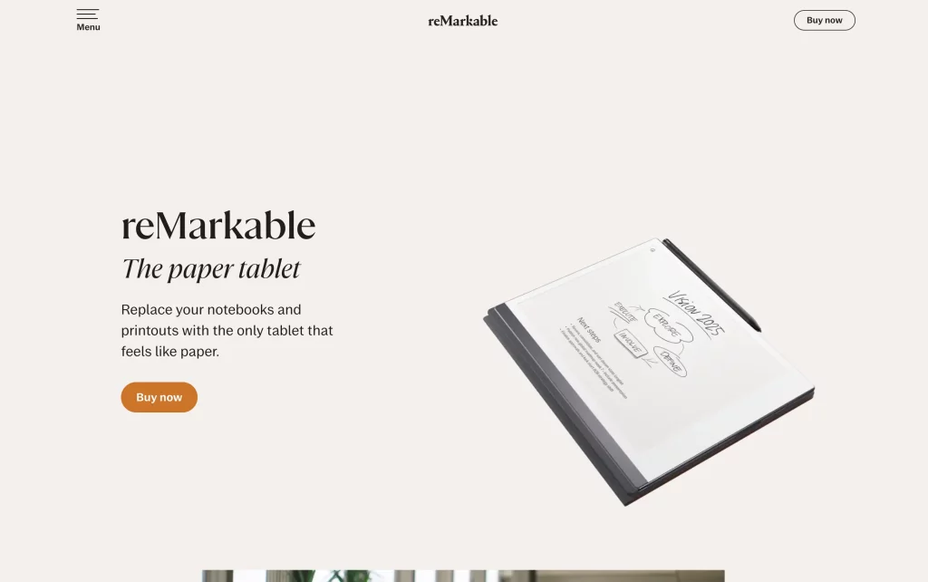
The subheading above the scroll simply states what readers Desire – “The paper tablet”. A short description explains what you can do with it: “Replace your notebooks and printouts with the only tablet that feels like paper” (Italics mine).
In the Agitation section, a video describes and shows what the ideal ReMarkable customer wants: focus.
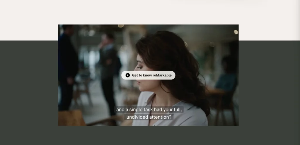
Being able to give one’s “full, undivided attention” to “a single task”. It shows someone making notes on the tablet, and we get to hear that deliciously scratchy sound of stylus-on-surface – it sounds almost like pen-on-paper. (Notice how the background colours change around the embedded video, indicating the transition from desire to solution.)
Next, the Solution section begins. Underneath the video, a short list summarises the key benefits of the device:
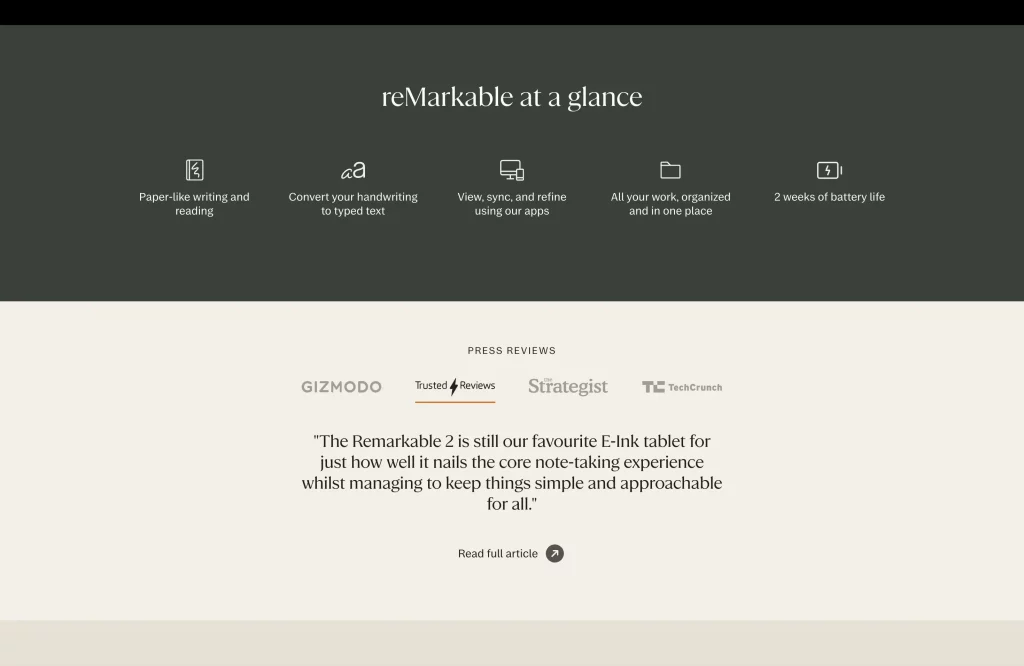
This is immediately followed by social proof. Press reviews with links to the full articles foster additional trust in these marketing claims. The rest of the page presents the tablet in great detail.
Example of PAS: Sales Page for the Linking Your Thinking Workshop
The Linking Your Thinking (LYT) Workshop is a cohort-based online course that teaches you how to make linked notes and think better.
Many of our clients wonder whether it’s a good idea to start their sales pages with lots of copy. First impressions count, don’t they? You don’t want to overwhelm visitors with a wall of text.
Yes, and…
The reality is, this text-heavy sales page regularly sells out the LYT workshop before enrolment officially ends.
That’s because the words touch on readers’ pain points. And they’re laid out so they’re easy to read. As a result, this copy-rich sales page builds a strong relationship right off the bat:
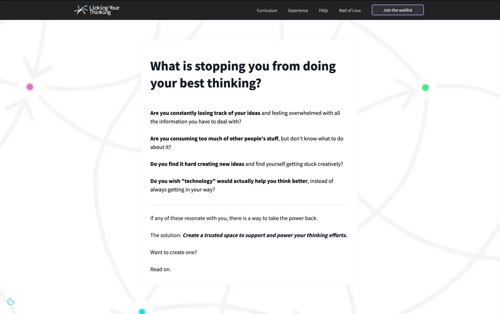
The big headline above the scroll addresses the Problem from a stance of wonder: “What is stopping you from doing your best thinking?”
The Agitation section asks 4 questions that foreshadow the kinds of problems participants learn to solve during the course. This is followed by the Solution: “Create a trusted space to support and power your thinking efforts.”
All of this information is above the fold. There’s no buy button in sight (other than in the Table of Contents) until you scroll.
This works because it contains all the basic elements needed to resonate with the ideal LYT participant and pique their interest.
The takeaway
- Whether you use PAS or DAS, your long-form sales page needs to start by connecting with your target audience where they are. Describe their problem or desire.
- Tip: Especially when using the DAS framework, start your page with “what if…”. Either use the words as a prompt to be deleted later, or simply ask the question near the top of the page.
- In the Agitation section, give yourself at least 3 to 5 sentences to paint a vivid picture of what your reader feels like. Show them that you know exactly what their problem is, or what they desire. In which scenarios does it show up? How does it change the way they behave? How does it affect their work or their family life?
- Finally, offer your solution. This should form the longest part of your sales page. Check out the next section to find out why.
Include all the information visitors need to choose you
Your ideal customer will either make a quick decision near the top of the page – or they’ll skim and scan the page to find the details they need. (If you’re interested, this 2020 NormanNielsen article explains how people read online.)
The high-performing sales pages for the reMarkable and the LYT Workshop are extremely long. So long, in fact, that my screenshot tool couldn’t capture the full page in one go. And yet – or precisely because of this –, potential customers stay longer on the page and are more likely to buy. Not that surprising, when you see that both pages do a fantastic job pulling out all the details of the experience and making them sparkle.
A simple technique to make sure you’re not leaving out crucial information is to zoom in on the look and feel of your product – or the emotions your offer elicits.
What does it look like, and how does it feel?
Storytelling isn’t just for case studies! By telling people what your solution looks and feels like, you’re helping them imagine what it’s like to use your product, take part in your course or receive your service. This process is also known as future pacing, a technique commonly used in neuro-linguistic programming. At the end of the page, readers will think, “I had a nice time thinking about that. I really want it now!”
If you sell a physical product, a lot of this is about photos – but words matter too.
While the reMarkable sales page includes 22 product photos, there’s a lot of copy, too:
- More details on the primary benefit (“As close to paper as it gets”)
- Benefits, features and advantages
- Information on software updates, the “Marker Plus” stylus, the “Type Folio” keyboard and other “Folio” covers
- Text elaborating on the main use cases, such as “An eye-friendly reading experience”, “Easily make notes on your documents” and “Send content to your reMarkable with a click”
- Technical details about the display as well as a table with technical specs
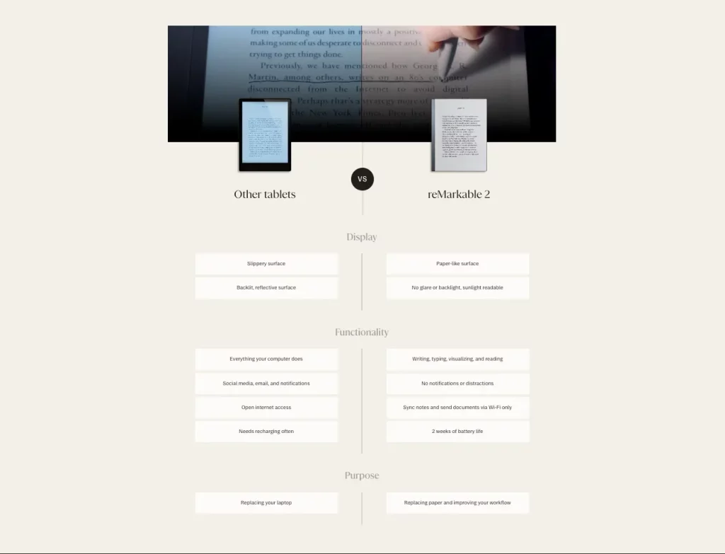
- A comparison table between other tablets and reMarkable 2
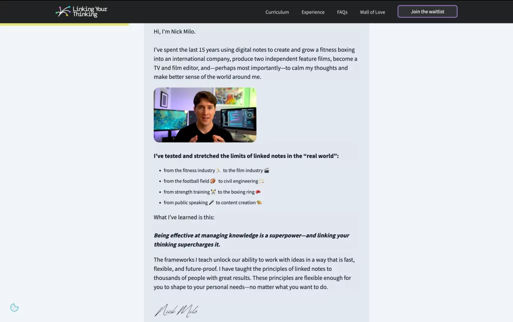
In contrast, the LYT workshop is shaped by its creator Nick Milo and his team.
So it makes a lot of sense for his personal story to lead the reader from the hero section (above the fold) and first call to action (CTA) to the course details.
- When Nick says, “I had no room for my own thoughts!”, his ideal audience will feel understood.
- Emotional language such as “I started to feel like I was losing a part of myself” is extremely relatable – and invites his audience to embrace their vulnerability.
- When he declares “There is a better way”, this audience will feel hope.
- His short bio helps readers to get to know their (potential) future workshop lead.
Next, the page presents client logos. Then we get into the specifics of the workshop. Note how the level of detail increases as the page progresses. Just like in a good news article, you get the most important information near the top – and the more you keep reading, the more detailed it gets.
- Short descriptions of 6 different use cases help visitors assess whether the course will help them.
- 7 testimonials with names and photos add varied social proof and touch on real results.
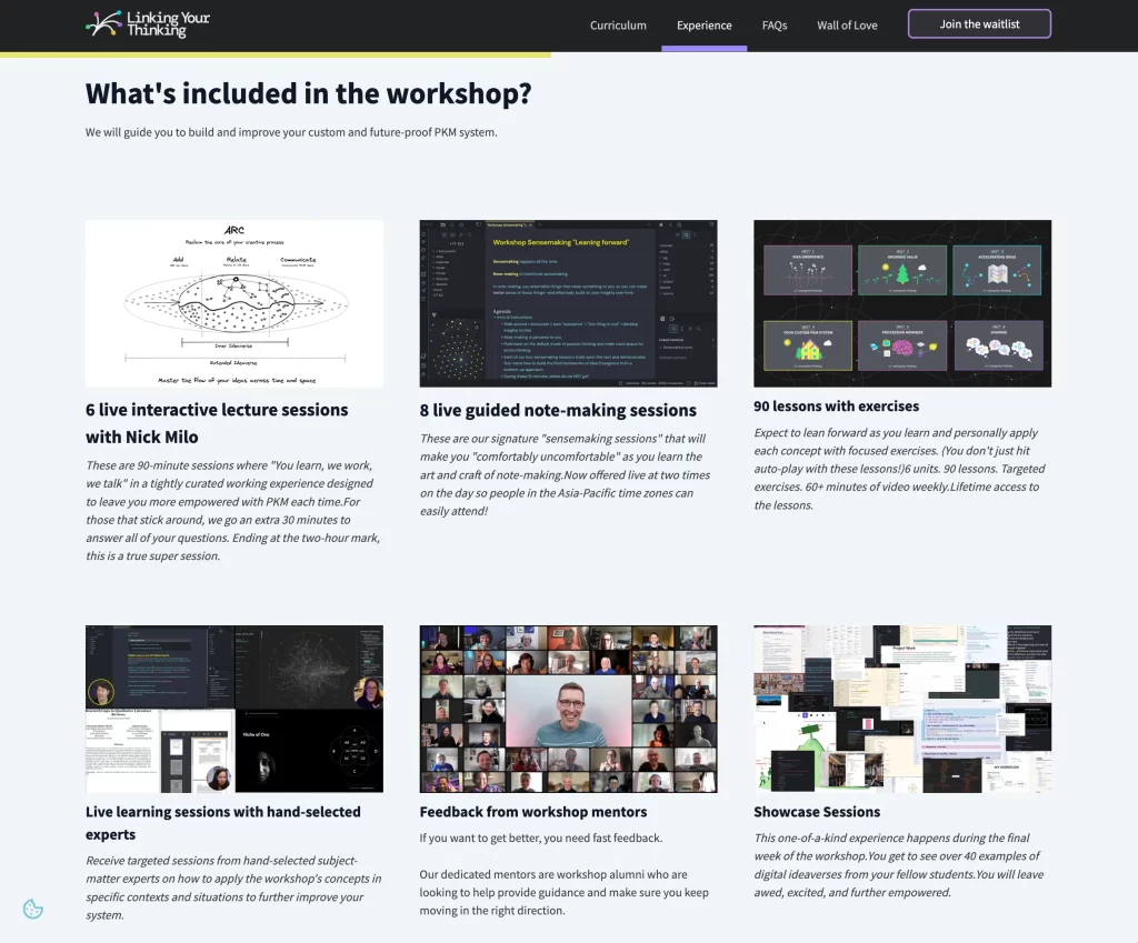
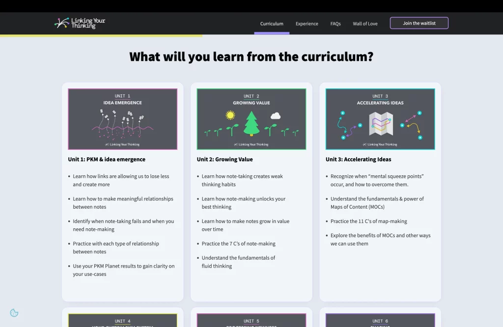
- A unit-by-unit course breakdown whets the appetite of would-be participants who want to make sure this is exactly the course they need.
- A list of what’s included in the course helps readers appreciate the value of the offer.
- Short profiles of the support and core teams showcase the calibre and diversity of the people behind the course.
- A dedicated section on “What makes LYT so different?” sets the workshop apart from others in the world of Personal Knowledge Management.
The first CTA came right after the hero section. The second – and main – CTA comes after all this content. This is also where you learn about the tuition fee for the first time. Which makes sense: A price tag of $1500 requires a solid value perception. And that’s exactly what the page has built so far.
But wait, there’s more! After the second CTA, the page continues to share even more specifics for those who want them:
- The workshop schedule
- An FAQ section with 11 frequently asked questions
- A summary of what makes the LYT workshop special
- 3 more testimonials with names and photos
- The 6 principles of Lean Forward Learning™ that make the workshop work
Phew! That’s a lot of information.
The takeaway
- Don’t worry about your readers’ attention span. Worry about attracting the right traffic to your sales page and bringing your offer to life for them.
- Use storytelling techniques and future pacing to help readers imagine their life with your offer. If it’s heavily dependent on you as a person, introduce yourself in a way that allows them to get a feel for what you’re like to work with.
- Clearly describe each and every feature, benefit or aspect of your offer.
- Include plenty of social proof by sharing testimonials, reviews and press articles.
- Include an FAQ section to elegantly respond to objections and coach readers in their decision-making process. Remember: you want some folks to say no to your offer. The sooner they realise it’s a poor fit for them, the better their – and your! – experience will be.
- Consider adding comparison tables, quick summaries, infographics and videos to keep things interesting.
What to do if you’re worried that your sales page might be too long
If you’re still concerned about the amount of copy on your page, bear these 3 points in mind.
- Do not expect visitors to read your long form sales page word for word, top to bottom. Use plenty of headlines, images, bullet points, a Table of Contents, layout and design to help them skim, scan and skip to the info they’re looking for.
- Your customers will spend a lot more time with you or your product after they’ve made their purchase. Give them a taste of what’s to come! Don’t miss the opportunity to connect by assuming they’re not interested. A visitor who doesn’t care that you’ve made the effort to educate them is most likely not the best fit for your business.
- The best sales pages have no repetition, just a gradual reveal of additional information. Every section, every word has its role to play.
To sum up: “short” does not equal “good”
The biggest myth in business writing is that short copy is always better. Yes, effective website copywriting means not wasting a single word. But even a 5,000-word sales page can have concise copy and a clean look.
To achieve a good conversion rate, use as much space as it takes to fully address your ideal customers’ needs. Remember to build an emotional connection. Include all the information that will allow them to make a considered choice. And let the user experience take care of making your page a pleasure to read.
At From Scratch, we create and continuously optimise high-converting sales funnels for our clients.
By designing a clear strategy for your whole sales copy, we make sure that your sales page, landing page and email marketing resonate with your desired audiences.
Plus, we create, develop and maintain website backends with great conversion-optimised design. Free from deceptive patterns, following a privacy-first approach – and minimising CO2e emissions.