
Written by:

Edited by:

Sally Fox

Holger Schueler
Table of Contents
Some businesses treat their homepage like the outside of a tube of jelly beans. Colourful brand imagery, plenty of serving suggestions, lists of attractively named flavours squeezed around the legally required small print such as nutritional information, customer service contact info. Oh, and your current prize draw too.
After all, who knows who’ll be visiting your homepage? It could be anybody. From a job seeker to a member of the press. From someone who mistyped a search term to a VIP customer.
It’s not surprising then, that structuring such an assortment of information can feel like a daunting task – and that homepages are the most difficult part of a website to write.
You’d think that 30 or more years after the first homepages were created, the internet would have solved this conundrum. But as a quick Google search reveals, most online advice isn’t up to the task.
First up, there are the blog posts like this guide to website structure, that use words like “webbed”, “sequential” and “matrix”. They’re far too technical for the decision maker who simply wants content that makes sense for their visitors.
Or, you’ve got the posts like this top-ranking article, that rattle off the various elements you’ll need, like a homepage shopping list. “Headline (duh!), sub-headline, call to action…”
The trouble is there’s no one size fits all when it comes to homepage structure. Yes, you might have all the components – but that doesn’t mean you have a well-structured homepage.
Why? One simple reason:
A powerful homepage structure is more than the sum of its parts
In this article, we’ll walk you through how to find the ideal structure for your homepage content – all illustrated with examples from 3 different industries: consumer products, B2B innovation and software as a service (SaaS).
- First, we’ll explain why homepage structure is so important – especially in e-commerce, and especially for mobile visitors.
- Next, you’ll learn to ask the key questions that will help you develop your homepage structure.
- Finally, you can sense-check how long your homepage should be in order to optimise for conversion – depending on your business model, industry and ideal customers.
Your conversion rates don’t rise to the level of your A/B testing.
They fall to the level of your page structure.
Let’s start with a look at how a poor homepage structure harms your business.
No structure, no traffic
Search engines use structural elements like headings, subheadings, images and links to analyse your homepage and determine what it’s about.
Let’s take Google as an example: The Google EEAT model prioritises web pages that demonstrate Expertise, Experience, Authority and Trust.
Wondering how structure plays into this? Well, think about some Authoritative, Experienced Experts that you Trust. Perhaps a medical doctor, a colleague or a university professor you admire. When they present information to you, it’s probably not a firehose of random remarks.
Applied to your homepage, it’s only natural that a logical structure will help you attract traffic and turn it into leads. After all, the page exists to represent you and your business as an Expert, Experienced, Authoritative and Trustworthy partner for your customers.
But ranking well on Google is not the only reason homepage content structure is so essential. It’s also one of the simplest ways to improve the experience of your mobile visitors.
And in turn, increase your conversion rates.
No structure, no mobile shop sales
Responsive web design may be the norm these days, but that doesn’t mean viewing homepages on mobile devices is a walk in a park. Here’s why: many homepages lack structure and overview. “Overview” lets visitors see the page or website’s structure at a glance so they can quickly get to where they want to go.
According to one of the most extensive studies ever conducted by Baymard Institute, disorientation and a lack of overview are especially prevalent in mobile e-commerce, where many products compete for our attention:
The issues caused by a lack of overview lead users to miss important information, select incorrect options, or draw conclusions that aren’t correct (e.g., a particular product isn’t available, when it’s simply out of view in a product list). During testing we observed many users abandoning a product or site because they couldn’t locate critical information.
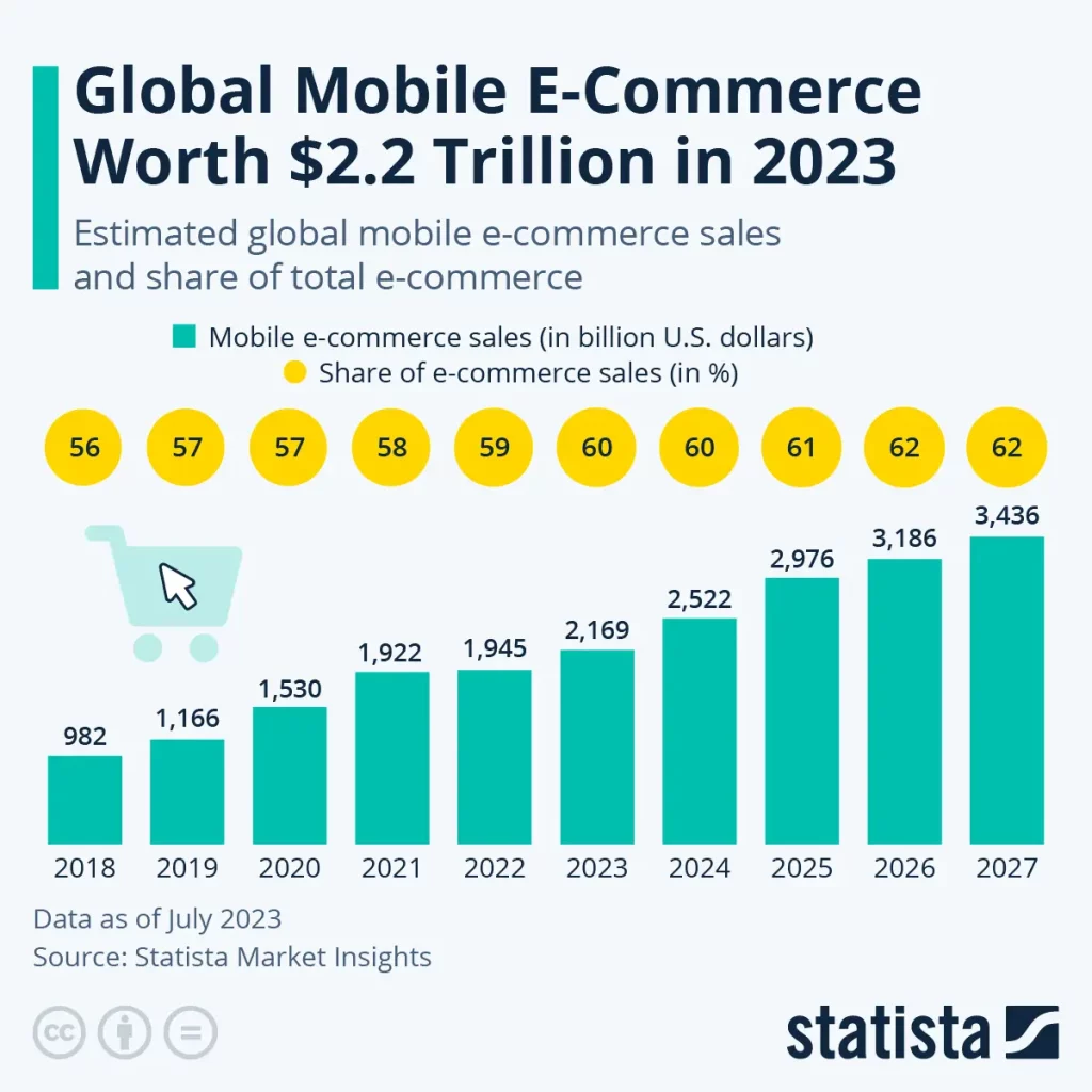
And nowhere is this issue more pressing than the e-commerce sector: Statista’s Market Insights report that in 2023 and 2024, 60 percent of all global e-commerce sales happen on mobile.
In other words, if you want to increase conversion rates, your best bet is to optimise the user experience of your online shop for mobile users.
How to get your homepage structure right for mobile visitors
If you’re looking to improve your website, run some user testing first. Just 5 to 10 tests per customer segment will reveal the most important stumbling blocks to taking action on your site.
Combine this with reading large-scale UX research to turn your findings into a prioritised road map. For example, that Baymard Institute study we cited proposes a number of improvements:
[…] a general solution was observed during testing which can help to mitigate some of the issues caused by a lack of overview: Keep It Simple.There’s always a tendency to add more features, more links, and highly interactive content to a site — all of which can benefit end users in certain circumstances.
Yet the primary goal of the site should never be forgotten — helping users find, explore, and purchase products — and it’s often observed in testing that this extra content, while perhaps well intentioned, harms users’ ability to maintain an overview of the current interface.
One may assume that, for example, having an extra promoted category in a product list is “no big deal”, or adding a sitewide free shipping ribbon won’t matter much, or having an “Install App” callout isn’t a “deal breaker”, but all of these can greatly harm users’ ability to get an overview of the mobile page — especially when the multiple additions are experienced at once — and consequently these issues are often observed to be a direct cause of mobile site abandonments.
In short, resist the urge to overcomplicate the mobile interface. Simple, clean designs were observed in testing to almost always support users better than complex designs that demand a lot of user attention.
Understanding Mobile E-Commerce UX: 5 Overarching Issues – Baymard Institute, original emphasis.
The takeaway: optimise your homepage structure for mobile traffic and SEO
- KISS: Keep your homepage structure as simple as possible. The clearer your structure, the more easily you’ll achieve a good content score, which is essential for SEO.
- Avoid making them scroll and scroll to find a table of contents or the end of the page.
- The best possible experience for smartphone shoppers may look wildly different from the one on desktop. So, if you’re in e-commerce, consider offering a mobile app.
- Never copy big online retailers like Wayfair, Macy’s, Walmart, Sephora or Amazon. No matter their reputation for conversion rate optimisation, they often get things wrong – as demonstrated by many examples in the Baymard Institute study.
- To continuously optimise your homepage structure, read relevant UX research and conduct your own.
These insights apply whether you’re in e-commerce or not.
Even if you’re a service provider or in the B2B software sector, it’s likely that a large proportion of your visitors visit your homepage on a mobile device: According to January 2024 data shared by Statista, smartphones accounted for almost 60 percent of global web page views – with slightly lower figures for Europe (52.62 percent) and North America (45.48 percent).
So, how should you structure your homepage?
To figure this out, you need to understand how people want to interact with it – and how to make that easy for them.
Here’s one simple technique we like to teach our clients:
Structure your homepage like a conversation with your ideal customer
This is another twist on our favourite mantra in Conversion Rate Optimisation: Just give people what they want. As a nice side effect, it means there’s no need to make your homepage super fancy or learn a whole new website theory.
All you need to know is who you want to attract – and what they’re looking for. Then you can help them get to the right place as smoothly as possible.
If you’re not sure what “the right place” looks like, think about the most valuable thing people can do on the page. In her book Websites that Convert, Claire Suellentrop recommends asking yourself the following question: “Will my business fail if I DON’T guide people to take this action?” (p. 10)
In practical terms, this means that less important or less frequent visitors such as suppliers, applicants or the press can have a link in a less front-and-centre space – such as the footer.
Let your ideal customer’s most important questions be your guide
Homepages have an important part to play on high-converting websites: They confirm to visitors that they’ve come to the right place. They answer people’s high-level questions. And they compel them to explore your website further.
The easiest way to achieve this outcome is to use the following list of questions as a starting point for building your homepage content structure:
1. What do you do?
Especially if you’re less well-known, use your value proposition as the main (H1) headline of your homepage. This will help people to quickly decide if your offer matches their needs.
2. Why should I care?
In a subheading or bullet points in your hero section (above the scroll), list your unique selling points, most important benefits or the values your business shares with your ideal customer.
This is also the best place for your main call to action, if you want to offer one towards the start of the homepage. Ideally, position it so that at least some of the logos or testimonials from the following section are visible without the need to scroll.
3. Do others like me care?
It’s time to back up your claims with customer logos, PR logos or testimonials. Make sure these represent the kinds of clients and customers you want to attract. If you opt for PR logos, link to the relevant articles or episodes and select outlets your ideal audience cares about.
4. How do you do what you say you do?
Answer this question and the messy middle of your homepage won’t be quite as messy anymore: Use a mix of headings (typically H2-H4), body copy, images and video to explain how you deliver on your value proposition.
- If you’re in e-commerce, consider showcasing your bestsellers, new launches or a sales promo. Make sure to include calls to action that lead to overview pages if you sell lots of different products. Otherwise people might assume that you only sell what’s displayed on the homepage.
- If you sell services, list the 3 to 5 most popular ones with a short summary and a link to more details. There’s no need to list every single thing you could potentially do for a client. Treat your homepage like a shop window: as long as customers know where to find more, it’s fine to keep some stock out of sight.
- On the other hand, if you sell a single product, such as a software tool, it’s worth going into a lot of detail right here on the homepage.
5. How will you improve my life?
Credibility is key. So, back up each of your most important claims with a proof point. We like the winning combo of a compelling H2 heading, some body copy and proof points (stats, case studies, reviews, testimonials).
6. Why is it safe for me to believe you?
Trust is the essential condition for conversion. If you’re a household brand, you won’t have to work very hard to build that trust: chances are it’s been passed down through generations.
Startup or challenger brands have to earn it first. One way to get a head start is by building on the trust of others. This is where certification or investor logos, information about returns, guarantees and customer service shine.
- For example, if your investors are extremely well-known, or you’ve received government funding, displaying the logo can go a long way.
- If you accept online orders, help people feel safe spending money with you. Embed logos representing payment methods, PCI compliance or a “Trusted Shops” certification on your homepage.
- Similarly, there may be 3rd-party certification logos that matter in your industry. If you’re in fashion or cosmetics, the Global Organic Textile Standard (GOTS) logo or the PETA vegan certification logo show you’re legit.
- Finally, it’s always a good idea to reassure visitors about easy returns, extended warranty terms or competent customer service.
7. Let’s say I believe you. Now what?
At the very end of the page, confidently invite visitors to take action. Make this section stand out. Give the heading, short body copy and call to action plenty of space. (The only content following this section of the homepage should be the footer.)
The takeaway: Structure must serve your ideal customers
- Outline your homepage structure based on this 7-question framework – modified from the 10/90 Messaging Layout Rule that Copyhackers originally developed for landing pages. Use the questions as prompts: reply to each one to write your content and decide which other elements would complement your answer.
- Inevitably, you’ll discover that you’d like to switch things up. That’s fine! By using this list of questions as a starting point, you’ll put your customers’ needs firmly at the centre of your homepage structure. And that’s the most important thing to get right if you want your homepage to convert.
- Conduct UX research with your ideal audience to refine your answers and structure. You can even run user testing sessions with your competitors’ websites to find out how well their homepage structure works. Who knows – you might just discover a winning formula that will set your homepage apart and convert better.
Don’t bore us, get to the chorus: your homepage does not need to be long
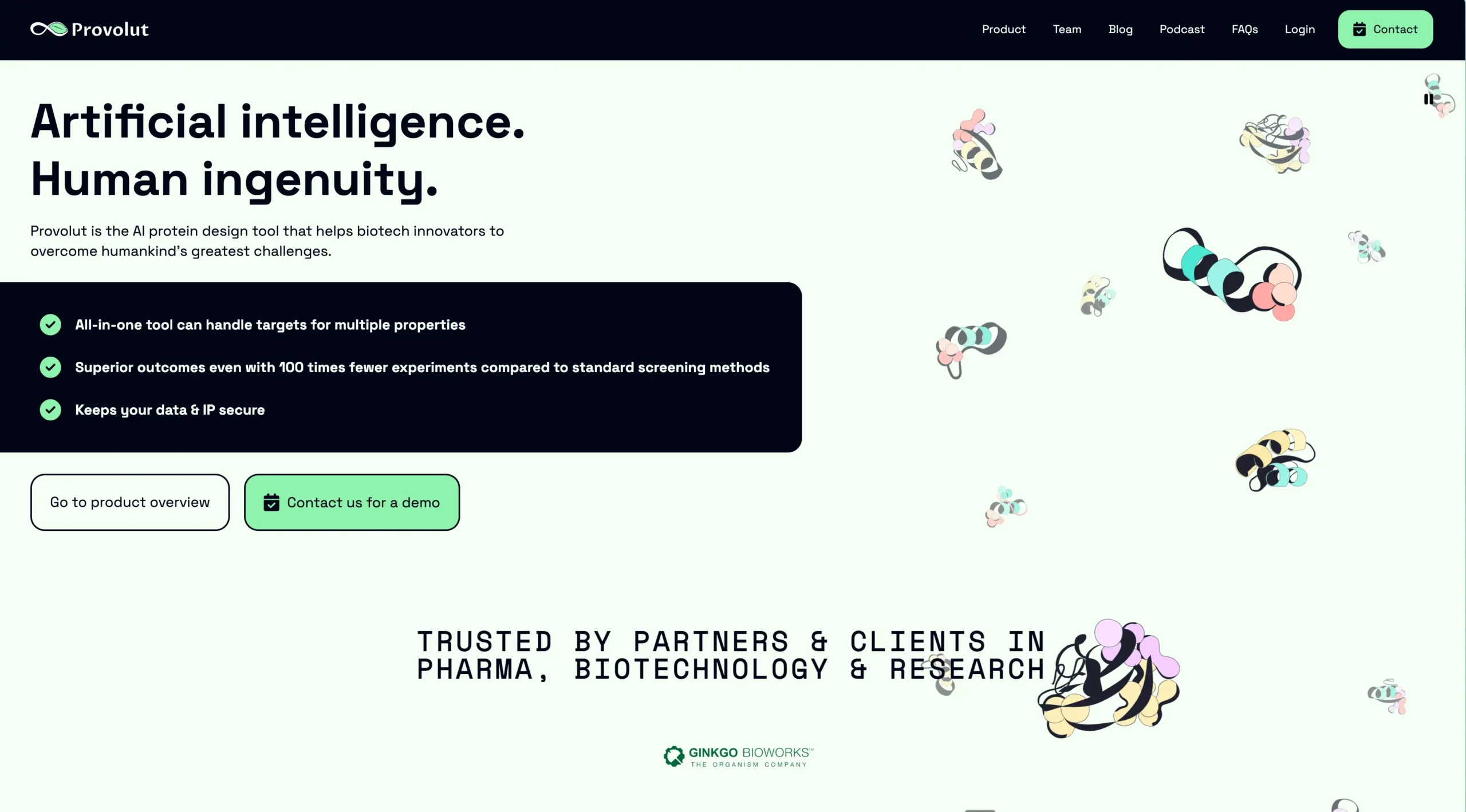
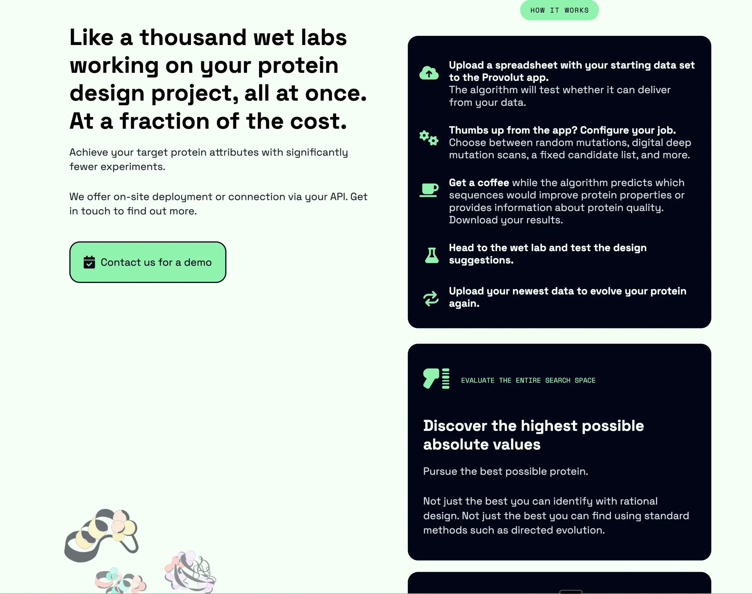
Maybe you’ve taken a look at our homepage or the one we made for Provolut, and now you’re worried you’ll have to create a super long homepage. In that case, rest assured: not every business needs a long homepage. It all depends on your business and your ideal customers.
5 signs a longer homepage may perform better for you:
- You sell mainly to other businesses.
- You expect your readers to make their purchase decision right there on your website.
- Your products or services are novel, innovative, high-end or out of the ordinary.
- You face a lot of competition in your industry.
- You charge premium prices.
5 signs a shorter homepage may convert better for your business:
- You sell mainly to private individuals (consumers).
- You’re in a B2B industry with longer sales cycles. You have a sales team.
- You offer familiar, self-explanatory products or services.
- You’re the market leader in your industry.
- Your prices are low or medium-range.
How the length of your sales cycle impacts the length of your B2B homepage
To buy or not to buy?
Just like Hamlet’s soliloquy, this decision may take place outside the dialogue with your website. If your business relies on a sales team, customer success, champion-building and offline marketing, your website needs to shoulder less of the sales conversation.
QuickSprout CEO Lars Lofgren explains:
Long-form sales pages are so long and keep all the copy in one place because the copy needs to take someone through the entire journey at once. The copy needs to do all the work.
For SaaS companies, the web copy is rarely responsible for doing all the selling. The sales funnels are typically longer, and the journey happens over multiple steps and multiple places.
(Source: Andrew Yedlin, Joel Klettke and Joanna Wiebe: How to write a SaaS website – hint: it doesn’t have to be super-short (Sept 2020)
Let’s look at an example: the homepage of Morgen, a calendar and task management app built in Switzerland.
- Morgen is a B2B product. There’s a lot of competition in their space: solutions like Calendly, Acuity, Simplymeet and Notion seek to attract a similar type of customer.
- But Morgen is different: It’s a calendar. It’s a meeting scheduler. It’s a task manager. It’s built in Switzerland, which is known for its high data protection standards. So, Morgen have a bit of explaining to do, to make sure visitors can appreciate the value on offer.
- The pricing table tells us that most readers try or buy the software based on the website – without a sales team getting involved: There’s a generous free plan, and the Pro plan will suit most smaller businesses. Only the Morgen Enterprise audience will need custom deployment facilitated by a sales team.
- The testimonials near the end of the homepage show that many Morgen users are individuals — folks who have identified a need in their personal workflows. As opposed to a corporate rollout of yet another tool.
Of course, if the Morgen strategy were the complete opposite of what’s described here, we’d recommend a completely different homepage.
The takeaway: Homepage length must serve your business model
Again, think of your homepage as a conversation:
- If you need a longer conversation to convince someone that you’re a first-class fit for them, choose a longer homepage.
- If it’s a spontaneous decision – or if your homepage is just the first step in a longer series of chats – then a shorter page will do the job better.
Homepage content structure is not rocket science: it’s people science
For many visitors, your homepage is the gateway to your product, your online shop – or the rest of your website. So, beckon them in with a friendly conversation. Help them to orient themselves. Answer their questions in a logical order. And don’t cut things short if they want more information.
If you think your homepage may need a little love, run 5 to 10 user testing sessions. Platforms such as UserBrain allow you to pay as you go for the exact number of sessions you need.
Prefer a helping hand?
Get in touch for an audit.
Let us coach you through your planned redesign.
Book an Impact Day for targeted support with message-finding and copywriting.
Or explore our all-inclusive High Fidelity programme for a 12-month transformation of your brand communication.
___
*Team members contributing to the Provolut website relaunch, in sequential order:
- Holger Schueler – client engagement & Intention Stack development
- Sabine Harnau – Conversion Rate Optimisation strategy, copywriting & creative direction
- Sally Fox – copywriting & editing
- Kristy Hanson – editing & web design
- Luke Finsaas – web design & development
- Maria Arango Kure – digital accessibility, web development & website optimisation
