
Services
- Conversion copywriting,
- Research & discovery,
- Web design
Team Members
Sabine Harnau
Research & discovery, Conversion copywriting, Web design
Learn how I wrote & designed a high-converting landing page that achieved a whopping 60% conversion rate.
The newsletter signup page I wrote and designed for multi award-winning social entrepreneur and mentor Nyasha Gwatidzo achieved a whopping 60% conversion rate. That’s 12x the conversion rate of the average landing page.
The goal was not to get as many sign-ups as possible — but instead, to ensure a perfect fit between Nyasha and her list. With the right subscribers, the list would be far more engaged and more receptive to the idea of booking Nyasha for mentoring.
While a conversion rate of 60% is certainly not a typical result, the steps I took to create this high-converting landing page are still a great guide to writing websites that convert.
Really getting to know the ICP (ideal client persona)
A lot of low-converting websites and landing pages are written quickly, in a scattergun approach: the same page is supposed to work for “everybody”.
Many entrepreneurs also invite all sorts of people to subscribe to their newsletter… and worry about the content of those emails later.
And I get it — we’re all busy and want to get our message out there, fast.
But that approach risks leaving website visitors feeling lukewarm. One-size-fits-all doesn’t exist in copywriting.
All our writing follows the Rule of One (not the Sith doctrine — the copywriting rule!). We write each piece for one distinct type of reader, exploring one big idea, making one offer.
With this in mind, I decided to start with a thorough understanding of the value Nyasha could add through her emails — and her ideal audience.
Creating the Launch Pad
The Launch Pad is essentially a detailed briefing document that contains every bit of information about our client, their ideal audience and the content they want to share.
For Nyasha’s landing page, I compiled it from a range of sources including:
- Interviews with former mentees
- Website and MailChimp analytics
- Interviewing Nyasha and
- Existing content (Facebook Lives, blog posts and LinkedIn activity).
This allowed me to take a deep dive into who we were going to attract: not just their demographics (global female social entrepreneurs who’ve been in business for at least 2 years) but also — and most importantly — their psychographics.
From that research, I knew that her ideal audience loved Oprah Winfrey, tried to live mindfully and worked extremely hard to make money for their mission… often while making big personal sacrifices.
Plotting the newsletter
Nyasha Gwatidzo mentors social entrepreneurs.
This means she operates in an increasingly crowded market, which is dominated by coaches and mentors offering their ‘blueprints’, ‘templates’ and ‘proven 5-step plans’.
In researching her audience, I found a perfect match between their disillusionment with people selling ways to ‘make money on autopilot’ and Nyasha’s unique approach. She doesn’t teach a generic course: instead, she engages directly with her mentees in order to help them discover the strategies that best suit them.
Her newsletter was therefore going to show off this special way of working.
We were going to combine mindset work ("what gets in the way of following your calling?") with Nyasha’s inspirational story ("allowing her to generate a cumulative $130 million turnover and over $25 million EBIT since 1987") and practical, easy-to-apply tips to make every day feel that little bit lighter.
With this background, it was much easier to write a landing page that resonated with the right people, and gave enough details to intrigue them.
Writing the landing page
Often, clients choose to work on the web design first, sometimes even relying on proven templates that later guide the flow of the text.
We prefer a copy-first approach: once we know the conversation that will take place on the page, a skilled web designer or developer can really work their magic to enhance that experience for the user. It’s rarely useful to squeeze the messaging into a pre-defined container.
Identifying people’s stage of awareness
Matching visitors’ stages of awareness is the most important thing to get right on landing pages:
- Are they completely unaware of the things a mentor could help them with?
- Are they pain aware — knowing they have a problem, but unsure how to solve it?
- Or are they already aware of the powers of mentorship?
Nyasha was going to use LinkedIn articles to invite people to the landing page, so we knew they’d be aware of who she is and what kinds of problems she can help with.
I knew I’d have to write just enough to explain Nyasha’s unique approach.
Writing the headline
The headline had to match people’s expectations based on what they had just read about Nyasha. It also had to get their attention and draw them in:
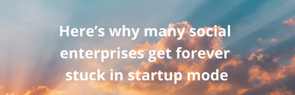
Following the principle of ‘tell them what you’re gonna tell them’, this headline gives just enough information to tell people they’ve come to the right place — while leaving all the juicy bits open… intriguing the reader enough to start reading the rest of the page.
Writing the body of the page
First of all, I wanted to show that Nyasha understands the pain of her reader. I used the first two paragraphs to draw attention to the dichotomy between the high dreams these hard-working social entrepreneurs set out with, and their current reality.
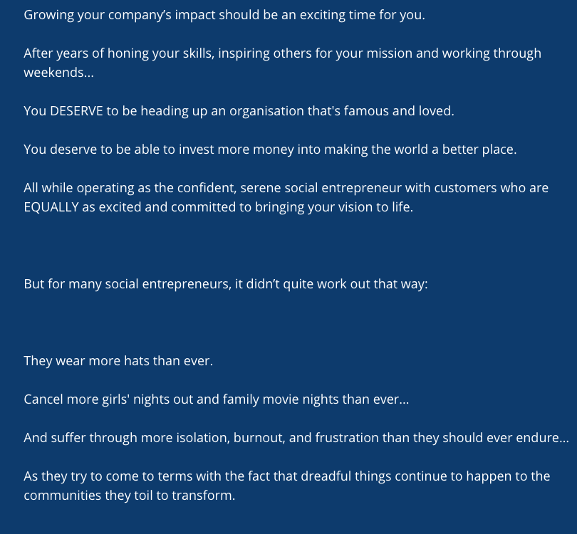
The text is deliberately laid out in many short lines, so it looks less like a wall of text and suggests effortlessness. The reader can fly through the page and absorb the content fast.
In my interviews, I had learned about some of their specific pain points and the language they used to describe those. Now was the time to mirror that language and use those specifics to show how close Nyasha is to their reality.
This part culminated in the revelation that “The only thing you’ll ever learn from other people’s ‘blueprints’ is what worked for them (not you)” — and an explanation of how Nyasha’s approach is different.
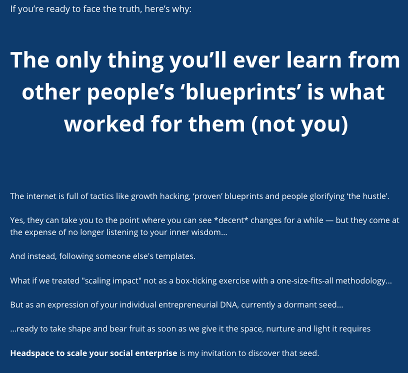
Note how the headline is centred to visually pull the message together. We usually prefer left-aligned headings, but this kind of cross head has an important part to play in structuring the message on the page.
Writing the call to action
I decided to call these emails a “journey of discovery” rather than a plain old newsletter — highlighting the benefit of engaging with these emails. This wording also conveys a sense of discovery which adds to the appeal of signing up.
I then listed all the good stuff Nyasha’s newsletter would cover:
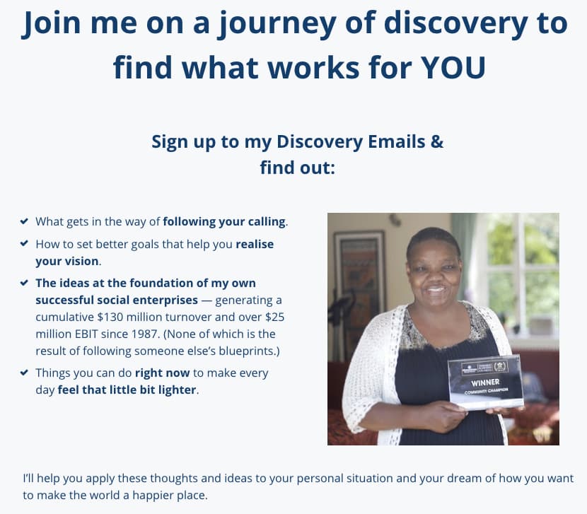
Since writing this page, I've learned that writing copy in all caps presents barriers to people who rely on screen readers – so I'd change that if I had another go. But the other layout principles here follow best practices: Nyasha's portrait is on the right, so readers can take in the bullet points more easily. Core ideas are highlighted in bold font, and the check marks instead of regular bullets add to the perception of value provided.
Just above the form itself, a headline and one line of copy explain clearly how to sign up and add information about how subscribers' personal details would be processed. This allowed me to keep the sign-up form simple and sleek, as readers would have all the information they needed to make an informed decision about signing up:
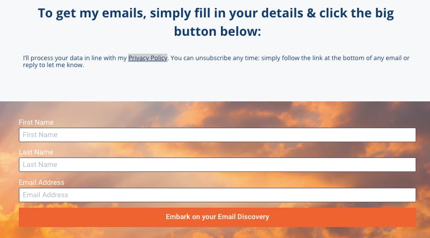
The background image of the sky at dawn frames the entire page – it's the background of the hero section and returns here at the bottom of the page. The sign-up form follows UX best practices by adding labels inside and outside the boxes. However, at the time I had had no training in digital accessibility. The colour contrasts are way too low, and the call to action almost melts into the background.
Designing the landing page
As we had no expert web designer on the project team, I built the page in Nyasha’s Leadpages account. Using free stock photos, I drew attention and added a bit of emotional oomph to crucial parts of the page.
It was important to me that readers could scan the page quickly, scroll to the signup field and join the newsletter even if they didn’t want to read all the details.
One way I achieved this was by placing Nyasha’s portrait right next to the benefits of signing up. Photos slow visitors down; they’re more likely to read text to the left of an image.
Get your own high-converting landing page
Why did this page achieve a conversion rate of 60%?
It’s the combination of detailed groundwork and a clear user journey:
from first hearing about Nyasha…
to readers on LinkedIn self-selecting as potential subscribers…
to reading an empowering message that resonates.
As a result of this work, Nyasha built a highly engaged list of subscribers, with most emails achieving open rates between 46% and 75%.
If you’re looking to boost conversion on your page, or boost your newsletter subscribers’ engagement, let’s chat!
Whether you’d like us to coach you to optimise your marketing, or write new content from scratch: we’d love to hear from you.
