
Written by:

Edited by:

Sabine Harnau
Table of Contents
Accessible copywriting is a trending topic – and can look like complicated niche expertise.
But all content on the web (and all writing, period) should be accessible and inclusive.
One thing stood out during our From Scratch team training: Accessible writing makes our job easier.
Often, low conversion or weak engagement comes down to complexity. Keep communication simple, and both accessibility and conversions go up.
We fix the same buttons and phrases every day, answer the same accessibility questions and debunk the same misconceptions. So, let’s teach accessible writing clearly and understandably.
Now, first things first: why bother at all?
Your organisation needs accessible content. And so do you and I.
Accessibility (often abbreviated to A11y) affects all of us at some point, and some of us all the time.
Typing with one hand because of a broken arm. Calling with a head cold. Shopping online outside on a sunny day. Those are small glimpses of inaccessibility that most of us have experienced.
Chances are, you will experience more barriers in your lifetime, as stated in this UN article on ageing and disability: Only 4 in 100 babies are born with a disability. But almost 1 in 2 people who are 60 or older have disabilities due to illness, accidents or ageing (46%).
What does that mean for our digital lives? As we age, barriers stack up.
And, accessibility is intersectional. It extends far beyond disability alone. It empowers all of us to participate in the digital world – whether we’re older, neurodivergent, ill or simply stressed.
Quick definition: “Neurodivergent” describes brains that process information differently from most people. For example:
- ADHD
- Autism
- Dyspraxia
- Dyslexia
- Dyscalculia
And yet, the internet is still an inaccessible place – with disabled folks facing the most barriers.
In digital communications, accessible content is still too rare. Email is a repeat offender: unclear buttons and links, no alternative (or ALT) text, too many emojis. Social media is not far behind.
Fortunately, a growing number of national and international regulations aim to secure the participation of all people.
2025 saw a number of updated accessibility laws and regulations, for example:
- UN Convention on the Rights of Persons with Disabilities (CRPD) and National Action Plans
- European Accessibility Act (EAA)
- EU Web Accessibility Directive
And while these rules don’t apply to all industries and website operators alike – inclusion is a human right, making it a moral obligation. Brands that claim to be authentic and inclusive have a chance to trail-blaze accessibility within their industries.
Not least because accessibility is good for business. The W3C Web Accessibility Initiative cites numerous studies that prove accessible content optimises the customer experience. And Search Engine Journal declares: Accessible content pushes your SEO scores.
In short: Accessible copy makes it easier for people to find you, understand you, and buy from you.
Accessible writing: how to avoid the most common mistakes
Accessibility means every reader can experience your message as fully as possible. Clarity is paramount: less effort for your readers. People will find it easier to absorb, process and remember what you have to say. (And more enjoyable, too.)
The most important element of clarity is structure. So, if you only remember one tip from our article, let it be this one:
Structured Content is accessible content.
Clear thinking creates clear writing. Readability starts before word choice.
Give your content a logical, transparent structure so readers in a hurry, with ADHD or using a screen reader can follow with ease.
Our 3 tips for clear structure:
- Plan ahead: What do you want to communicate? Organise ideas in a logical order. Cut the fluff.
- Keep sentences short. Aim for 11-20 words. According to the British Government blog Inside GOV.UK, comprehension drops beyond 25–29 words – even for “highly literate people with extensive vocabularies”.
- Signpost. Highlight important messages and transitions. Recap main points in 1-2 sentences. Use bullet lists for memorable takeaways.
Make link and button texts discernible and unique.
According to the 2024 Accessibility Report by the Email Marketing Consortium, almost 3 in 4 emails have no discernible link text (73.73%). Almost 1 in 5 use unclear unclear link and button texts (16.92%).
Case in point: this newsletter from Aesop. Here’s a screenshot to show what we mean:
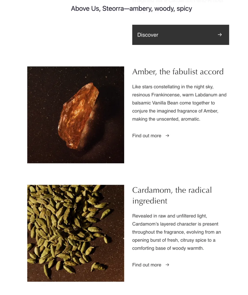
Imagine accessing the newsletter with a screen reader: “Discover.” “Find out more.” Over and over. To know what each link does, a visually impaired subscriber must listen end-to-end. It’s tiring. It’s unfair. And it hurts conversions. For an e-commerce newsletter, the plain result is: fewer sales.
Instead of using “Find out more”, this email could simply specify the link destination. Check out the links in this article as an example: They tell you exactly where they lead.
However, in this example, the fix is slightly less simple. You’d probably expect the first “Find out more” to lead to a page about amber, and the second to a page about cardamom. But that’s not the case: both links lead to the Product Detail Page (PDP) for the Eau de Parfum Above Us, Steorra, which contains amber and cardamom as ingredients. There’s no additional information here – except about the product.
If you find that setup slightly disappointing, you’re not alone. This is a great example of accessible copywriting leading to better content and copy overall: The email – and probably the entire campaign – would benefit from additional content highlighting the advantages and traditions associated with key ingredients like amber and cardamom. To make this section work, we’d recommend creating dedicated landing pages that convey their value.
Alternatively, we’d ask for a change to the email design so both ingredients can be presented together, with a single, powerful Call to Action linking to the PDP.
(If you’re wondering whether code could fix this: Yes, ARIA labels could make repetitive links more accessible. But not every email client supports these labels, and Aesop does not use them in this email.)
Our 3 tips for accessible link and button texts:
- Make link and button texts clear, unique and relevant. If two links go to the same URL, use the same link text. For different URLs, use different, descriptive link texts.
- Label meaningfully. Readers should know exactly what happens when they follow a link or activate a button—even by ear alone.
- Top tip for linking to a source: match the page’s H1 in your link text. That way, readers land where expected and can instantly orient. And your copyeditors spend less time fretting over the link text, because it’s already there in the destination.
Express yourself clearly.
The best copywriting advice Sabine ever received came from Carolyn Beaudoin, then Conversion Rate Optimisation Lead at Copy School and Agency Copyhackers. When editing my new homepage copy, she commented: “What does this mean to your reader? Say that.”
Strip the fluffy packaging. Write the message you need to land. Your text gains clarity – and impact. That’s accessibility paying off for everyone: sender and recipient.
Our 3 tips for clear wording:
- Pair playful headlines with crystal-clear subheads; keep body copy on point.
- Use clear, concrete everyday language. Even for complex topics and educated audiences.
- Choose your words to fit your audience. Do your readers prefer the most exact or the simplest word? If you’re heartset on jargon: First, explain the facts in everyday language. Then introduce the term in parentheses.Example: “Migrate data” vs “move data.” “Migrate” suits a tech-savvy audience; “move” serves less technical readers.
Do not make your copy too complex.
20 years ago, only educators used readability tests. Now, many copywriters and content designers use them, too. Many are free and simple to use, helping you pinpoint clarity and accessibility issues.
But numbers are not one-size-fits-all.
The right level of complexity always depends on your desired audience. If in doubt, offer multiple versions (such as Plain English or Easy Read – see our Easy-Read page for an example).
During our From Scratch accessibility training with digital accessibility expert Casey Kreer, we learned: Readability test results may not be meaningful for expert, disabled and neurodivergent audiences. Everyone experiences different kinds of barriers.
- Some people use pictograms, emojis and graphics to help them understand text. For others, these visual aids add barriers. And much depends on the specifics.
- For niche or expert audiences, readability scores often mislabel clear, jargon-appropriate content as “too hard.”
- Most tools do not highlight metaphors and neologisms – even though they challenge many readers.
- Sometimes choices clash: An approach that helps readers with ADHD may hinder Autistic readers.
Casey taught us a principle that often helps us decide: If there are several ways to express something, choose the method with the fewest serious barriers. Limited understanding for one group is better than no understanding at all for another.
Despite their limitations, readability tests are helpful tools for checking the complexity of your content. We recommend the following tests to help you clarify and simplify your writing:
- Flesch-Kincaid Readability Index in Microsoft Word
- Readability Scores in Grammarly
- Hemingway App
Not happy with the results of your readability test? Try these:
Our 3 tips for plain language
- Replace longer/more complex words with shorter/simpler alternatives.
- Break up longer sentences. Delete wordy phrases and filler words (like tautologies).
- Use the active voice. Start your sentences by saying who’s doing the doing – avoid attaching “by (person)” at the end.
Make your layout easy to read.
As writers, we design experiences. Layout makes or breaks those experiences. (Hence the term “content design”).
Our 3 tips for an accessible layout
- Use proper formatting styles. “Big and bold” is not formatting. Stick to H1 ( main title, only one per page), H2 (subheadings) and H3 (subheading to the preceding H2) to organise your page.
- Keep paragraphs to a maximum of 5 sentences. Add a subheading roughly every 300 words. This improves readability and SEO.
- Write numbers as digits. They’re easier to scan than spelled-out numerals.
Spotlight: Accessibility for people using screen readers
What is a screen reader?
Simply put, screen readers are built-in or purchased software programs that read what’s on your screen. Most users customise voice and speed. This makes screen readers more accessible than generic text-to-speech tools and overlays.
If you’re not visually impaired, know this: Screen reader users usually handle your content differently than you might imagine.
Here’s an example. Sighted readers often skim top to bottom, jumping via design cues: buttons, images, tables, headings, colours, links. But hearing is linear. Words, phrases, and prompts reach our ears one after another, not all at once. While the eye can take many sensory inputs at once, our audio processing cannot multitask: A 2018 study by the University of Maryland suggests that humans have difficulty listening to more than one conversation simultaneously.
So: Content structure is vital. Logical setup and correct formatting let screen readers identify and read out headings and links in a targeted way. The result: Visually impaired and blind people navigate your text more easily – and so does everyone else. Information should be just as easy to find for screen reader users as it is for sighted readers.
By the way, directions like “top” and “bottom” make no sense for screen reader users. This kind of directional language assumes a visual map. Use structure instead – then delete those terms.
Emojis and abbreviations can block screen readers
Screen reader programs are great, but they’re also just machines. They rely on good data to do a good job. Let’s give them signal, not noise.
Most devices read emojis out loud, making copy longer and sometimes confusing. Some skip them altogether. Different screen readers – and operating systems – render them inconsistently. At best, this can dilute your message. At worst, it might deplete it.
Our 3 tips for using emojis:
- Never substitute a word with an emoji. Do not rely on emojis for meaning.
- One emoji per piece of content, social media post, or email subject line.
- Place emojis at the end of a sentences to avoid interrupting the flow.
For more info on how to use emojis accessibly, check out “The secret life of emojis”, an article by accessibility expert Ettie Bailey-King.
Alternative text and image descriptions
Alternative text (also known as ALT text) is hidden text that screen readers and search engines read for images, GIFs and memes. It helps blind and visually impaired people, neurodivergent users, and anyone on a slow connection.
Our 3 tips for ALT text:
- Convey the image’s meaning. If it adds context, teaches, or makes us laugh, the ALT text should achieve the same.
- No need to write “Picture of …” unless the medium/format matters (like a sketch, a caricature, or a sepia portrait).
- Reproduce all text contained in the image accurately and literally.
Image descriptions are visible captions. They’re always a good idea. It’s one of the foundational lessons in journalism that captions are among the most read bits of content. (Here’s a handout on captions used at Harvard that makes this point.) They can be longer than ALT text. Use that space to explicitly highlight what the image merely implies, such as feelings or cultural context.
Spotlight: Ableism
Let’s be clear: If your content promotes an ableist worldview, accessible writing won’t make it inclusive. Neurodiversity and disability affect everyone – directly or through someone they love. Only dismantling the idea that each of us must conform to the same standards will ultimately make your content more inclusive.
Our 3 tips for avoiding ableist language:
- Avoid ableist expressions or medical terms as value judgements. For example, say:
- dreadful/bad instead of ill/sick
- reasonable/helpful instead of healthy
- ignorance instead of blind spot
- being ignored instead of falling on deaf ears
- exciting/intense or bad/problematic instead of crazy
- bland/boring/stale instead of lame
- Avoid instructions that assume everyone uses devices in the same way. Not everyone clicks or works with a mouse. Prefer inclusive verbs: focus (on elements), activate (a button), select (an option), follow (a link).
- Avoid generalisations when talking about disabled, older or neurodivergent people. Simply insert the short but powerful word “may”:
- Autistics may take your words literally (but not every Autistic does all the time).
- Older people may struggle with Gen Z jargon (but some may be proficient due to their social media habits or grandchildren).
- Deaf people may write differently than hearing people (but much depends on how reading and writing are taught at school).
Bonus: Heteronyms
A heteronym is a word that has different meanings depending on its pronunciation.
Example (we’ve linked the phonetic script to YouTube videos showing the pronunciation):
- You can pronounce the word “desert” /dɪˈzɜːt/, which means “to abandon”.
- When you pronounce it /ˈdez, ət/, you’re talking about an arid region or wasteland.
Our bonus tip for using heteronyms:
If the meaning is not clear from context, rework the sentence to avoid the heteronym. If that’s not possible, inform the client or developer that they will need to add pronunciation info for screen readers.
Free Notion template: Accessible copywriting checklist for your company style guide
This free Notion template is packed with actionable tips on clarity and accessible copywriting. It includes everything from this article, with plenty of space to add your own notes on brand voice and tone.
No email sign-up required: In a few clicks, you’ll have an easy-to-follow checklist – and an editable document that you can customise to your brand.
Exclusive offer for template users: Get a 60-minute workshop on how to make the most of this guide, tailored to you and your team. You can book straight from the template.
Looking for support embedding accessible writing in your marketing and branding? You’ll find a 20% discount code for tailor-made accessible writing workshops and copywriting services directly in the template.
